
DEW4. Monitoring Earth Systems
Chapter 4
I. Forest Watch
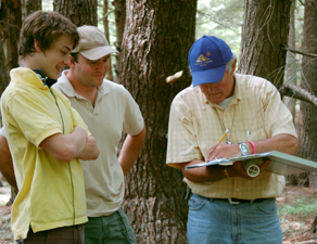
Forest Watch (https://forestwatch.sr.unh.edu/index.shtml) is a project in which data on tree characteristics are collected by teachers and students in grades K-12 as an integral and important component of research on forest ecosystems in New England. Each participating classroom is given study plot. Currently under study are White Pine and Sugar Maple. The project originated in 1986, when Concord High School science teacher Phil Browne appealed to NASA scientists to help his students regain their trust in science and in NASA. UNH scientist Barry Rock, answered Browned and together, they brainstormed Forest Watch. The project conducts teacher training workshops for teachers joining Forest Watch.
The stated educational objectives of Forest Watch are to:
- Engage K-12 students in authentic science.
- Engage students in using 21st century scientific and technological tools.
- Enhance students’ critical thinking about science.
- Develop students’ data analysis and communication skills.
- Encourage team-work and inquiry-based learning.
- Meet state and national standards in science, technology and mathematics.
- Build students’ interest in and aptitudes for science, technology and mathematics.
The science objectives are to:
- Assess white pine health at both the local and regional level.
- Correlate student biometric measurements with spectral measurements of needles.
- Compare biometric and spectral measurements with tropospheric ozone data.
- Document the use of white pine as a bio-indicator of the health of New England forests.
- Develop a long-term database.
- Assess white pine health using a site index.
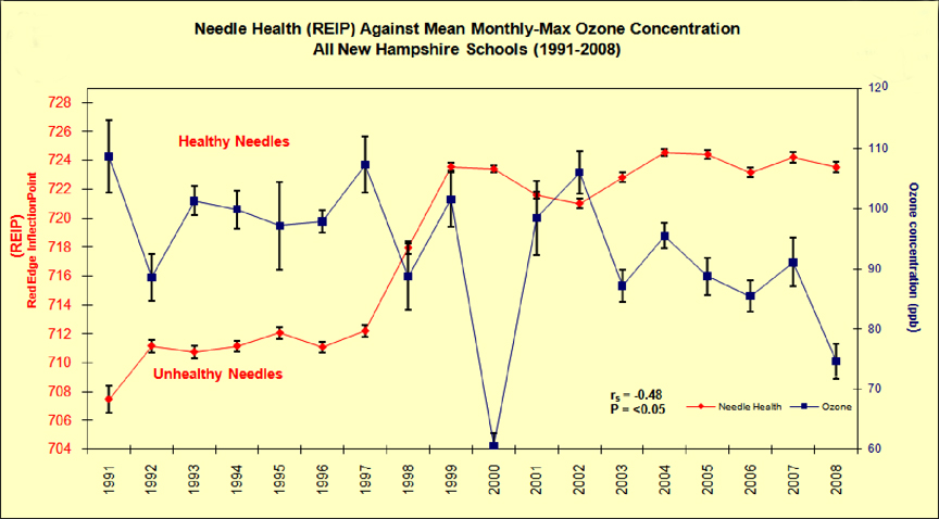
In White Pine (Pinus strobus) Research, the Forest Watch program has studied the effects of ground-level ozone on the health of New England’s forests since 1991. The Forest Watch chart of ground-level ozone concentrations shows that when needles were unhealthy in the 1990s, ozone levels were high. When ozone levels began to drop, white pine health soared. White pine is a bio-indicator tree, being sensitive to air pollution and ground-level ozone exposure. Many other species of trees in the New England forest are able to close their stomates against ozone when levels climb, but while White Pine may close stomates at very high levels of ozone, they maintain open stomates at levels of 60 to 80 ppbv. Forest Watch has confirmed the connection between ozone levels and white pine health. Over the past two decades, in all but a few drought years, white pine health has declined when ozone levels were high. White pine health has improved when ozone levels dropped.
The Forest Watch chart of ground-level ozone concentrations (below) shows an inverse relationship with white pine health. When needles were unhealthy in the 1990s, ozone levels were high. When ozone levels began to drop, white pine health soared. Research by scientists and students has helped to improve air quality standards set by the Environmental Protection Agency.
Maple Watch grew out of a 2008 a master’s degree thesis study of thirty trees near the Bearcamp Valley, New Hampshire, that found water stress in 100% of trees; reduced chlorophyll content in 60%; early abscission of leaves in 80%; reduced growing season in 70%; and poor fall foliage color in 80%. Maple Watch continued in 2009 and 2010 and had least two schools piloting the program in 2011. Maple Watch aims at addressing projections by the U.S. Forest Service that climate change–warming temperatures–over the next century may eradicate most of the sugar maples in the United States. This study involves five components:
- Historical records and climate change measures
- Anatomical measures of maple health
- Spectral measures and remote sensing
- Chemical measures of maple health
- Outreach partnership with citizen scientists
As an example, analysis of leaves from sugar maples in a classroom plot on Bald Mountain in Campton, NH, showed damage of a smog event which occurred on May 26, 2010. Forest Watch research concluded this was caused by peroxyacetyl nitrate, a powerful oxidant.
Forest Watch data all the way back to 1993 are posted on the Internet – https://forestwatch.sr.unh.edu/data.shtml
Forest Watch scientists also use an expensive spectral reflectance measuring instrument to study the health of white pines in New England. The instrument produces images quite similar to satellite imagery from remote sensing instruments that capture light reflected from Earth three bands of visible light (blue, green and red that our eyes can see) as infrared light (in Band 4), near infrared (in Band 5), and very long wavelengths in Bands 6 and 7. Forest Watch uses Multispec software to mix and match any of the 7 Landsat bands of information. Each different combination allows us to see different Earth features more clearly.
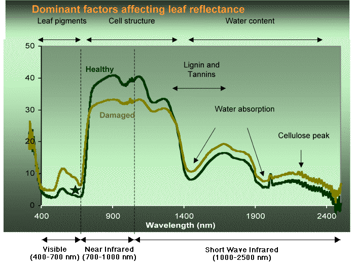
Below is a typical pattern for a healthy set of white pine needles.
The Y-axis of the graph represents the amount of reflected light from the pine needles. Large values indicate that most of that wavelength of light is reflected, low values indicate that much of those wavelengths is being absorbed.
The X-axis represents the wavelength of light (if needed, review of the electromagnetic spectrum). The seven bands of light that Landsat measures are marked by shaded vertical boxes.
A spectral curve (below) shows the location of each Thematic Mapper Landsat Image band, 1, 2, 3, 4, 5 and 7. Each band and comparisons of bands give scientists information about the health of plants as well as the identity of other features on Earth. The same light which a satellite sees reflected from Earth is what we see in the laboratory reflected from leaves or needles. This image shows the spectral curve of light reflected from some Forest Watch white pine needles.
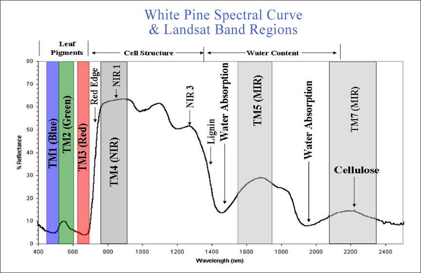
Notice that plants absorb most of the red and blue light shining on the needles. In the near infrared, plants reflect a tremendous amount of light, which is why plant leaves are so light colored in near infrared digital photographs.
Now compare the differences in reflected light patterns from two sets of white pine needles, one that is healthy and a second with stressed needles. Notice that the stressed leaves reflect less near infrared compared to the healthy needles, and reflect more red and blue light. This latter pattern allows us to use plant stress detection filters to see the health of plants when walking through fields and forests.
From satellite, we use a combination of near infrared and red light to monitor plant health. This is explored in the Vegetation Analysis Investigation.
To illustrate how various wavelength bands can be displayed as 3-color visible light images, below are three views of Mt. Washington, the tallest mountain in New Hampshire. Forest Watch schools in North Conway and Bartlett lie just south of the mountain.
Each view is different. Each gives us different information about the mountain, the forests, lakes and towns around Mt. Washington. What can you see?
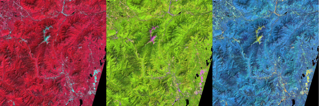
The green image is a 5,4,3 selection. Band 5 (mid-infrared) displayed as red; Band 4 (near infrared) displayed as green; Band 3 (red) displayed as blue. Which of the three bands do you think is more reflective? Did you guess “Green!” This combination allows us to compare water in plants. Can you decipher where the conifers are and where the deciduous or mixed forests are?
The blue image is a 2,5,4 selection. Green light reflected from forest canopies, captured as Band 2 by Landsat, is displayed in red! Mid-infrared light is shown in green. And near infrared is shown in blue. Again, which band is most reflective? Healthy plants reflect 60 to 80% of all the near infrared light which falls on them. Which are more reflective—deciduous trees or conifer trees?
II. Remote Sensing
Aerial Photography
As soon as humans could be carried off the ground with hot air balloons, people began taking pictures from this wondrous vantage point (see MIT summary of views of aerial photography). Then came people flying on airplanes, taking pictures. And with the advent of the electronic age, people could put cameras on much smaller things—too small to carry a human—like smaller balloons, kites, and more recently drone aircraft and helicopters.

DEW4.1. Investigation: Aerial Photography
Get started using a kite, balloon, blimp, or drone to get your own aerial photographs.
2025-09-04. Can the global drone revolution make agriculture more sustainable? By Ben Belton et al, Science. Excerpt: Use of drones has increased considerably over the past decade, reshaping activities as diverse as warfare, entertainment, delivery services, and disease control. One of the most consequential uses of drones—in agriculture—has taken off globally within only the past 5 years. This is upending expectations and may help to reconcile a fundamental sustainability dilemma—how to produce more food by using fewer inputs—but is also inducing trade-offs. This rapid change has been largely unnoticed by researchers outside of the specialized technical worlds of aeronautical engineering and precision agriculture. …We explored evidence and hypotheses about global agricultural drone diffusion and its implications for sustainability and set out an agenda for future policy and science…. Full article at https://www.science.org/doi/10.1126/science.ady1791.
Satellite Images
Way back in the late 1950s we moved into the Space Age and cameras and sensors we put onboard satellites. This satellite data, processed through computers, changed our understanding of Earth and its many intertwined processes.
Satellites have provided an important viewing platform for many of Earth’s complex environmental processes. The first satellite to take photos of the Earth was launched in 1960, but scientists began to systematically monitor our planet’s land resources in 1972. Satellite sensors continue to provide us with a wealth of information about natural processes in the atmosphere, biosphere, hydrosphere, geosphere and cryosphere. As our data record grows and improves, we can see and measure a greater number environmental processes, their interconnected behaviors, and how they change over time.
Today, a growing amount of satellite data is available for free over the Internet. With a basic understanding of a few key concepts and access to software tools, we may use the data to deepen our perception of the world in which we live, including your neighborhood!
There are two types of remote sensing instruments:
- Passive instruments detect natural energy that is reflected or emitted from the observed scene. Reflected sunlight is the most common external source of radiation sensed by passive instruments.
- Active instruments provide their own energy (electromagnetic radiation) to illuminate the object or scene they observe. The instrument sends a pulse of energy from the sensor to the object and then receives the radiation that is reflected or backscattered from that object. Radar is an example of an active instrument.
If you have not done it previously, do the investigation from A New World View:
AN5.1 Satellite Views of Rondonia, Brazil.
You can read more about remote sensing instruments used on satellites at NASA’s Earth Observatory website.
Here are some good sources of satellite images:
- https://eros.usgs.gov/image-gallery/earthshots
- https://earthobservatory.nasa.gov
- https://www.earthkam.org
- Google Earth – http://earth.google.com/
- https://worldwind.arc.nasa.gov
- https://epic.gsfc.nasa.gov
- https://visibleearth.nasa.gov
See also
DEW4.2. Investigation: What Can You See From 400 Miles Above the Earth?
Use Google Earth, Modis images and Iconos images to explore what Earth looks like from space.
III. Digital Images Not Based on Visible Light
There are two types of digital images that are not based on visible light (so are not photographs):
- maps representing the amounts or presence of a variable and
- images based on electromagnetic radiation outside the visible light spectrum (often called representative or false color images).
When making a map of a spatially distributed variable, the magnitudes of the values are converted to color intensities. In some cases, the values are converted directly to a color intensity of red, green, or blue, or the values can be divided among a variety of colors, as shown in the image below. In this example, the color key is essential to convert the colors to the original values of chlorophyll in the ocean. With image analysis software, such as AnalyzingDigitalImages, you may select a range of colors and display only these values, so you will be able to display specific ranges of phytoplankton concentrations using the image below.
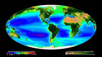
(http://oceancolor.gsfc.nasa.gov/SeaWiFS/BACKGROUND/SEAWIFS_970_BROCHURE.html) have been monitoring phytoplankton for more than a decade by analyzing the color of the ocean, which is affected by the amount of chlorophyll in the floating plankton. The colors in map above are based on the concentration of phytoplankton across the oceans.
Because each digital image contains three color layers, up to three sets of data may be displayed in each image. Below is an example of what three different fields of data would produce in the final image. If you know how to interpret color, you will be able to identify how the trends do and do not overlap, which then helps to explore cause and effect or at least correlation between variables. For this example, let ocean temperature be displayed in the red color layer, ocean salinity in the green layer, and phytoplankton concentration in the blue layer. In all three layers, black represents the lowest values, the the brightest intensities of a given color the maximum value of the variable.
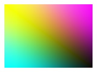
In the fictitious example above, the source of warm and cold water appear to be different from the causes of high and low salinity. There is an interesting correlation of the phytoplankton: it is lowest where temperature and salinity are lowest and when both are near maximum values; and the highest phytoplankton concentrations in cold water with high salinity and in warm water with low salinity.
IV. Earth Images Through the Internet
Images obtained through the Internet can be analyzed using the DEW Analyzing Digital Images (ADI) software, Multispec, or other software or methods appropriate to the investigation and experience of the learners.
Digital images are available at a variety of scales. Picture post pictures (described in investigation DEW3.1. Observe Changing Vegetation) taken with digital cameras provide close-up views of local landscapes, whereas aerial photographs and satellite scenes provide ever-broader views all the way to coverage of the entire globe. Of interest for Digital Earth Watch are both spatial and spectral features within images and how these features change over time. Information in an image is limited by the spatial resolution as well the repeat cycle for the capture of successive images. Aerial photographs are taken occasionally while satellite imagery may have a repeat cycle of one or several days. Picture Post pictures repeat as often as people take and share pictures from their post. There are many sources of imagery available from the Internet.
DEW4.3. Investigation: Get Earth Images
Find the best sources of images showing Earth systems.
2025-07-30. Signal Acquired From NASA-ISRO’s NISAR Earth Satellite! By NASA Science Editorial Team. Excerpt: Mission controllers for the NASA-ISRO NISAR (NASA-ISRO Synthetic Aperture Radar) mission have received full acquisition of signal from the spacecraft. The satellite will provide high-resolution data to help decision-makers, communities, and scientists monitor infrastructure and agricultural fields, refine understanding of natural hazards such as landslides and earthquakes, and help teams prepare for and respond to disasters like hurricanes, floods, and volcanic eruptions. The spacecraft launched from Satish Dhawan Space Centre on India’s southeastern coast…at 8:10 a.m. EDT. Read more about Wednesday’s launch here…. Full article at https://science.nasa.gov/blogs/nisar/2025/07/30/signal-acquired-from-nasa-isros-nisar-earth-satellite/. See also The New York Times article, When Earth’s Surface Shifts, a New Satellite Will See It.
2025-07-10. Giant radar satellite set to probe Earth’s shifts and shudders. By Michael Greshko, Science. Excerpt: NASA and India’s $1.5 billion NISAR mission promises global time lapses of the planet’s ever-changing land and ice… Full article at https://www.science.org/content/article/giant-radar-satellite-set-probe-earth-s-shifts-and-shudders.
2025-04-17. “Transformational” Satellite Will Monitor Earth’s Surface Changes. By Kimberly M. S. Cartier, Eos/AGU. Excerpt: In a few weeks, Earth scientists will launch a satellite that will provide unprecedented, high-resolution coverage of some of the most remote and rapidly changing parts of the world. The NASA-ISRO Synthetic Aperture Radar (NISAR) satellite, a joint mission between NASA and the Indian Space Research Organisation (ISRO), will scan nearly the entire globe twice every 12 days to measure changes in Earth’s ecosystems, cryosphere, and land surface…. Full article at https://eos.org/articles/transformational-satellite-will-monitor-earths-surface-changes.
2025-04-16. A Diverse New Generation of Scientists Observes Earth from Above. By Gregory R. Goldsmith, Monae Verbeke, Jeremy Forsythe and Joshua B. Fisher, Eos/AGU. Excerpt: Project-based learning and a modular class design help students from various backgrounds and universities gain hands-on experience with environmental remote sensing…. Full article at https://eos.org/science-updates/a-diverse-new-generation-of-scientists-observes-earth-from-above.
2021-11-18. Getting the Big Picture of Biodiversity. By Elizabeth Pennisi, Science Magazine. Excerpt: …remote sensing methods are not only revolutionizing how scientists …study ecosystems, they’re also poised to become powerful new tools in the fight to protect them. …scientists have gathered to revise the most important international treaty aimed at conservation, the Convention on Biological Diversity (CBD). With the loss of plant and animal species accelerating, some researchers say conservation efforts should turn to remote sensing to monitor biodiversity in near–real time across wide swaths of the globe—and help policymakers prioritize the most critical areas. …As the light displaces electrons inside chlorophyll, the intensity of red and infrared (IR) light emitted from the leaves varies, depending on how healthy the plant is. …fluorescence could be detected from an airplane flying over crops, opening the way to surveying fields’ productivity remotely. …airplanes, drones, and towers all provide spectroscopic data on vegetation. So does NASA and the U.S. Geological Survey’s series of Landsat satellites, the first of which were launched in the 1970s. Initially, the agencies expected the satellites’ cameras to primarily capture images in visible light, but an experimental spectral sensor on board proved the value of recording more of the electromagnetic spectrum, such as near-IR light, and by 2013 the satellites were monitoring 11 portions of the spectrum. With these “multispectral” data, researchers can monitor how “green” or productive a vegetated landscape is. Spectroscopically detected dips in chlorophyll can also signal a forest that is suffering because of drought or insect invasion—or has been cleared for development.… [https://www.science.org/content/article/satellites-offer-new-ways-study-ecosystems-maybe-even-save-them]