
DEW3. Analyzing Plants and Ecosystems
Chapter 3
Plants are indicators of the quality of the local environment that impacts all living creatures in the area. Can we examine plants to be able to read their signs of an unhealthy environment and be able to identify the causes of the problems?
To do that, it’s good to know about basic plant processes, the many ways plants respond to their environment, how to measure plant characteristics, and how we can monitor plant health using growth characteristics and proportions of different wavelengths of light reflecting from their leaves.
I. Measuring Plants
Let’s use the spatial measuring skills we learned in Chapter 2 to measure physical characteristics of trees.

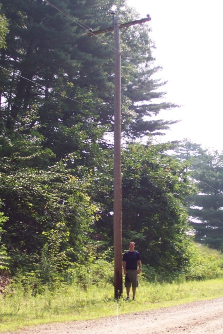
DEW Challenge: How Tall Is the Tree?
Measure the height of the tree and telephone pole in the photographs below.
Download the images of the trees below. Use the AnalyzingDigitalImages software “Spatial” window and select the “Line” tool to make measurements.
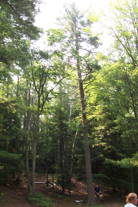
The person standing next to the tree and pole in these photographs is 6 feet tall.
To download either image, right-click or click and hold on the image. A pop-up menu will have the option to ‘Save Image As…’, which allows you to save the image on your computer. You may do this to download most images available on the Internet.
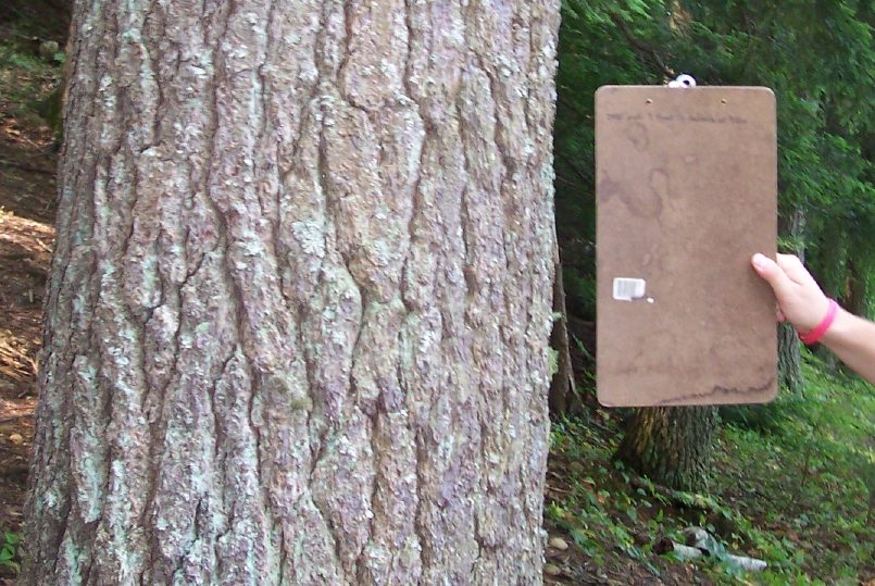
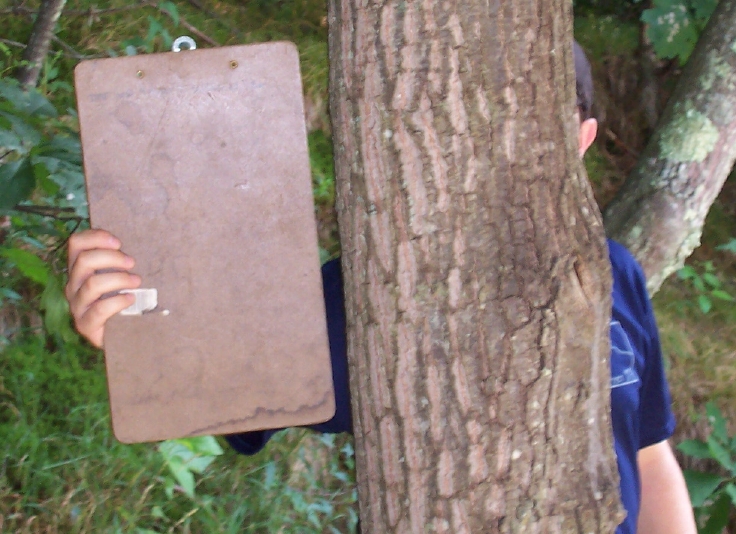
DEW Challenge: Tree Diameter
Foresters use a measurement of a tree’s diameter called DBH or “diameter at breast height”. Tree diameter is an important forestry measure and is used to indicate how well a tree is growing over time. It is also one of the standard measures of timber volume used to estimate the commercial value of a forest stand. By convention, the diameter is measured at a height on the trunk that is 1.35 m (4.5 ft) above ground level. This height above the ground is used because uneven swelling and irregular growth at the base of the tree and upper roots could mask the true growth of the trunk. The Forest Watch project recruited teachers and students to study white pine trees. DBH served as a yearly measure to help characterize the growth of the white pine trees under study.
Measure the diameter at breast height (DBH) for the trees in the pictures below. Note: The clipboard is 9 inches wide and the location to measure is across from the bottom of the clipboard.
Download the images of the trees below. Use the AnalyzingDigitalImages software
“Spatial” window and select the “Line” tool to measure the tree diameter.
To download either image, right-click or click and hold on the image. A pop-up menu will have the option to ‘Save Image As…’, which allows you to save the image on your computer. You may do this to download most images available on the Internet.
DEW Challenge: Pine Needle Length
Measure the lengths of the pine needles in this photograph.
What is the average length of the needles?
Bonus Challenge: How much error is introduced by the curvature of the pine needles?
Download the image. Use the AnalyzingDigitalImages software
“Spatial” window and select the “Line” tool to measure the the lengths of the needles.
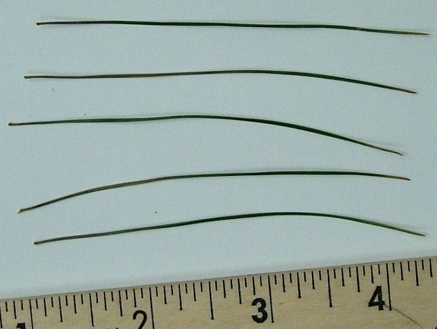
To download, right-click or click and hold on the image. A pop-up menu will have the option to ‘Save Image As…’, which allows you to save the image on your computer. You may do this to download most images on the Internet.
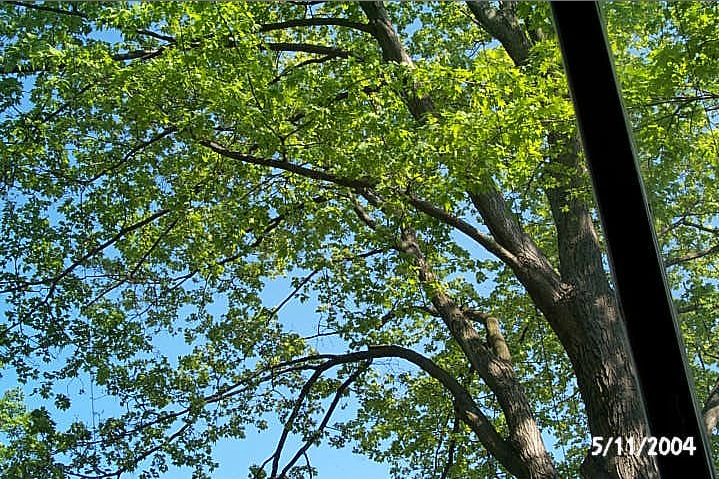
DEW Challenge: Tree Canopy Growth
Calculate the change in the percent leaf cover as this maple tree as it greened up in the spring.
This can be done by creating a mask based on selecting a range of shades of green,
and then measuring the area of the selected green.
Download the three images of tree canopies below and open them in the AnalyzingDigitalImages software. Use the “Mask Colors” window. It may help you to review the DEW Investigation “2.2. Spatial Analysis: Area” on how to use masking to measure areas.
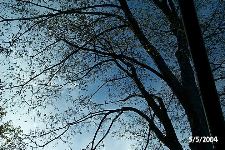

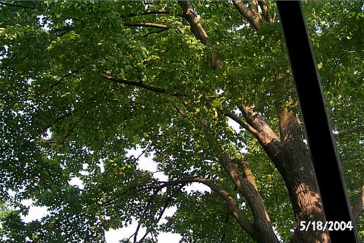
To download, right-click or click and hold on the image. A pop-up menu will have the option to ‘Save Image As…’, which allows you to save the image on your computer. You may do this to download most images on the Internet.
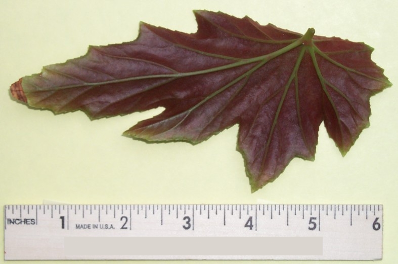
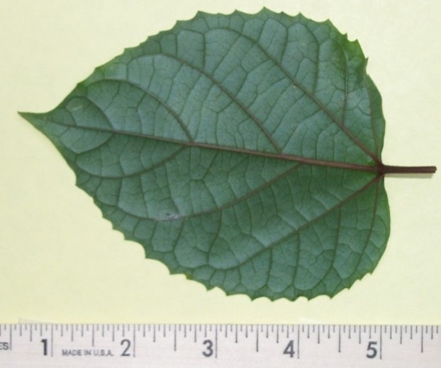
DEW Challenge: Leaf Area
Find the area of the leaf below. As a check, compare the area with that of second leaf (this is the underside of the same leaf).
Download the image below and open it in the AnalyzingDigitalImages software. Use the “Mask Colors” window. It may help you to review the DEW Investigation “2.2. Spatial Analysis: Area” on how to use masking to measure areas.
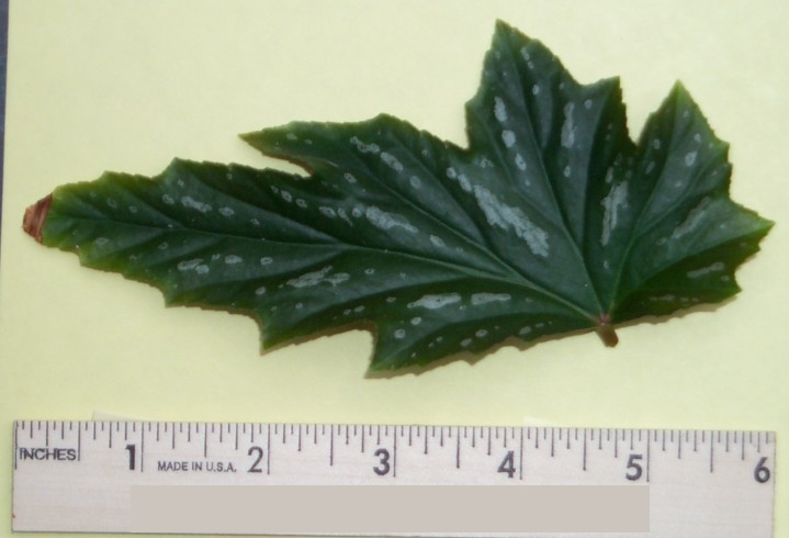
Bonus Challenge:
To download, right-click or click and hold on the image. A pop-up menu will have the option to ‘Save Image As…’, which allows you to save the image on your computer. You may do this to download most images on the Internet.
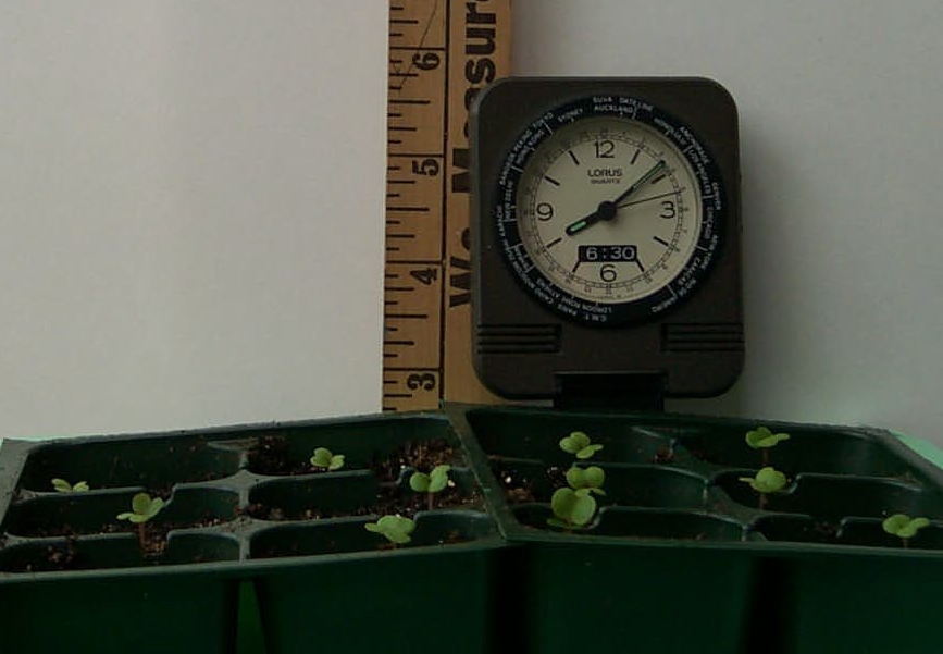
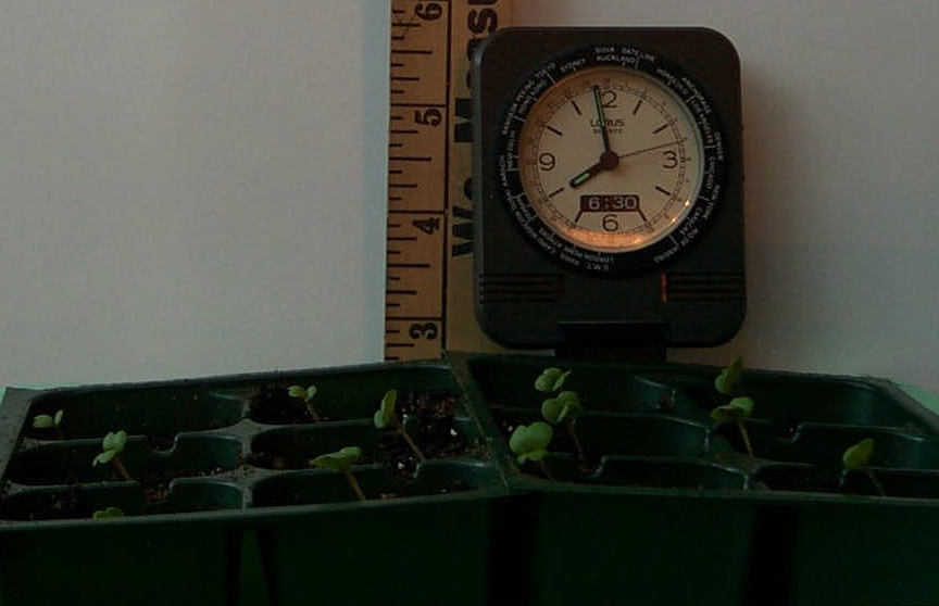
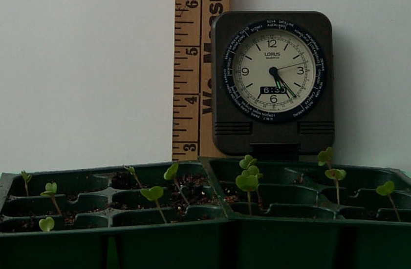
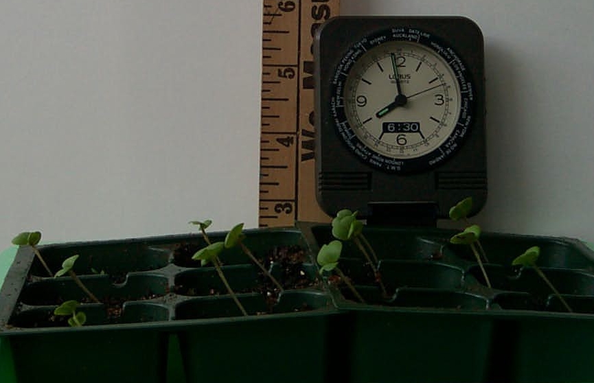
DEW Challenge: Do Plants Grow At Night?
Do plants grow at night? If so, how does the rate of growth compare to what is observed during the day? Calculate the growth rate of this Wisconsin FastPlant during the day and night.
Download the images of the seedlings below. Use the AnalyzingDigitalImages software “Spatial” window and select the “Line” tool to measure the growth rates of the plants.
To download, right-click or click and hold on the image. A pop-up menu will have the option to ‘Save Image As…’, which allows you to save the image on your computer. You may do this to download most images on the Internet.
II. Light on Plants
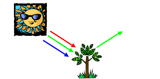
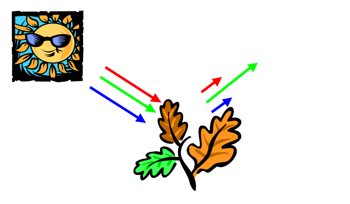
Here are examples of light reflected from a leaf (below left) and light transmitted through leaves (below right). Since green light is both the predominant color reflected and transmitted, it is the color that is least absorbed – and the one that is not used by plants for photosynthesis.
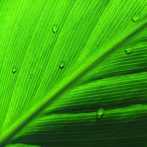
When viewing the leaf’s reflected light (left), think of the colors being subtracted (or absorbed) by the leaf. Red and blue light are absorbed by the leaf.
When viewing the transmitted light (right), the leaves are acting like a filter that subtracts light. Again the red and blue light are absorbed by the leaf. The green is passing through.
Photosynthesis is the process associated with green chlorophyll that converts electromagnetic energy into chemical energy that becomes food plants and indeed food for all living organisms. The blue and red light are the primary energy sources that drive the photosynthetic process, which typically on land, occurs in leaves, the solar collectors for photosynthesis.
Light interacts with all objects in three possible ways: it may be absorbed, reflected, or transmitted through the object.
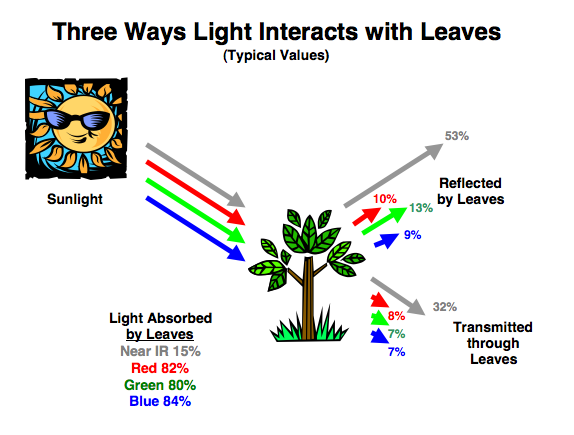
The colors of light that drive photosynthesis (or that chlorophyl absorbs) are red and blue light.
The amount of light reflected by leaves depends on how much is absorbed by and transmitted through them. Much of the light absorbed by leaves is used for photosynthesis. Plants respond to competition by sensing the proportions of light transmitted through and reflected by neighboring plants.
Other ways that plants use light besides photosynthesis are the realm of a subject know as photobiology.
As mentioned in chapter 2, when we use images that are acquired using cameras that are far above or far from the objects of interest to us, the data gathered that way is called remote sensing.
It makes sense that most remote sensing techniques for monitoring vegetation using cameras on airplanes, balloons, drones, or satellites involve analyzing the proportions of different wavelengths of light reflected by leaves.
DEW3.1. Investigation:
Observe Changing Vegetation
Make time-lapse images of a plant budding or analyze leaves of different ages on the same plant.
III. Pollens From the Past
Have you ever wondered if the trees in your backyard have always been there?
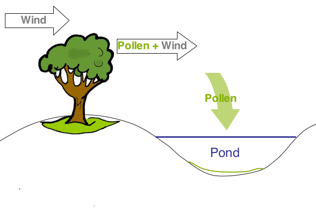
Although plants don’t actually move, the wind, birds, and insects distribute their seeds, which allow new trees to grow in different areas. To pollinate the flowers that produce the scattered seeds, many plants release large amounts of pollen in the air. Some pollen gets buried and preserved in sediments of nearby lakes, ponds, swamps, and bogs. By sampling the sediments and extracting this pollen, scientists can track the movements of a species of plant.
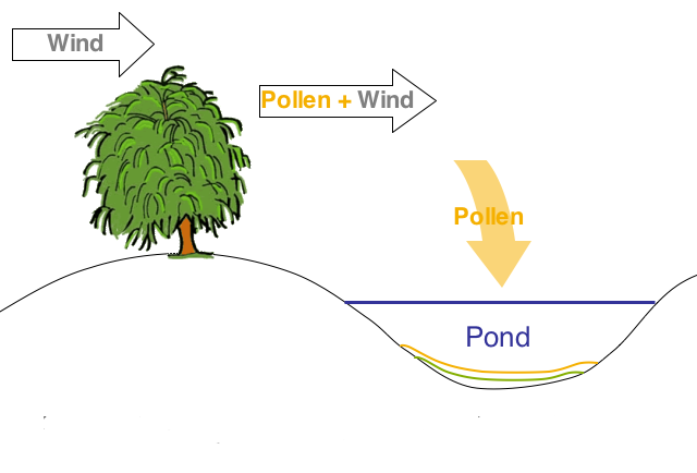
Each year, pollen from nearby plants (trees, grasses, shrubs) is deposited in ponds, lakes, swamps, and bogs
Pollen is unique for each species of tree and other plants.
If the plants around the pond change, so will the type of pollen deposited in the water.
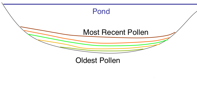
Scientists study the pollen buried with the sediments to estimate which types of plants lived near the pond at the time the pollen was deposited with the sediments.
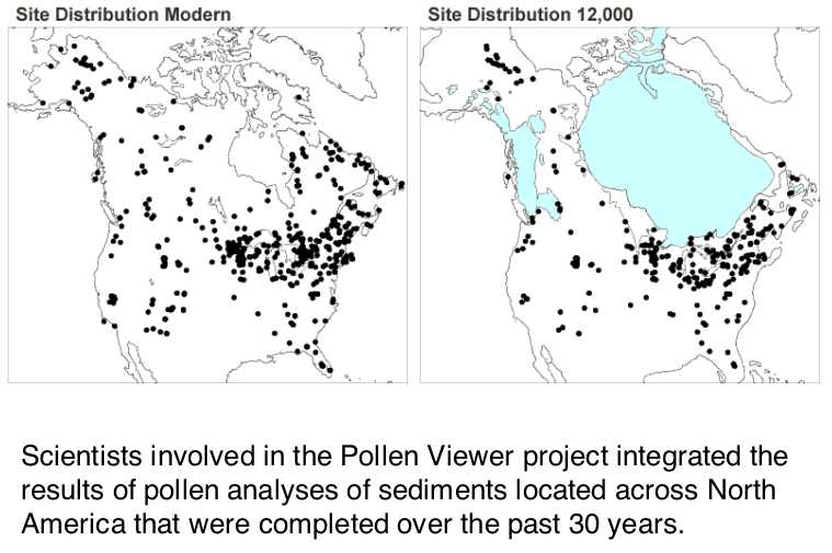
Pollen distributions from 12,000 years ago to modern times are displayed in Pollen Viewer on a NOAA website.
By studying the plant pollen found in sediments deposited in lakes and bogs, scientists have mapped the distribution (location and relative population) of plant species in North America as climate has warmed from the end of the most recent Ice Age. The trees are not moving on their own, rather the scattering of their seeds allow new trees to grow in areas that best suite the spruce. The trees growing in unfavorable climate conditions die.
In the movie below, spruce trees, which thrive in cooler climates, advance northward as the ice sheets and the region of favorable growing conditions retreat poleward.
This is one of the concerns of human-induced climate change: Will climate conditions move too quickly for plants to keep up by seed redistribution? If this happens, entire populations of plant species would be lost.
DEW3.2 Investigation:
What Has Been in Your Backyard?
See how the population changes in time for a plant species you choose in an area that you select.
You may want to have a look at the Global Systems Science book A New World View where there is an investigation, How much old growth forest was lost?, about how forests in the U.S. have changed in the past few hundred years.
IV. Temporal Analysis of Satellite Images
The word temporal means “of or relating to time.” The images of Dallas at the end of the previous chapter show how satellite images captured at different times can reveal very important things to us.
West Las Vegas
The images below show the rapid growth of Las Vegas, Nevada, by far the fastest-growing metropolis in the United States:
- 1964: 127,000 1986: 608,000
- 1972: 273,000 1992: 863,000
- 1997: 1,124,000
Satellite images
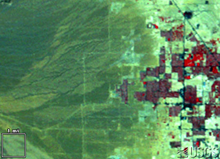
LM1042035007225790 (Landsat 1 MSS, 13 September 1972)
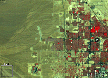
LM5039035008625390 (Landsat 5 MSS, 10 September 1986)
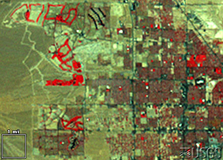
LM5039035009225490 (Landsat 5 MSS, 10 September 1992)
These are the same kind of standard false-color images that appear throughout Earthshots (https://eros.usgs.gov/earthshots), simulating color-infrared aerial photographs. Remember that the standard representative image scheme is “R-G-B = IR-R-G”: red, green, and blue in the image represent how much infrared, red, and green solar energy the ground reflects.
As the city expands you can see a sort of landcover succession through human construction.
- Pre-construction land appears medium gray-green indicating sparse desert vegetation, reddish soils, and stone.
- Construction land appears brighter. Bulldozed soil, bare of vegetation, is very reflective.
- A young neighborhood appears medium green (medium green) again, perhaps a bit brighter from all the reflective pavement and roofs. The trees are small, and some developments now conserve water by landscaping with rock and desert plants rather than grass.
- An old neighborhood appears dark, brownish red, from the mature trees and more grass.
- Golf courses appear bright red because they are the most intense vegetation.
- Water appears almost black because at this angle it scatters little light back to the Landsat sensor.
Chernobyl
A devastating nuclear accident happened at Chernobyl, Ukraine, on 26 April 1986. The images below show the area around the nuclear power plant approximately one month after the accident, and six years after the accident. This area is near the common borders of Ukraine, Belarus, and Russia.
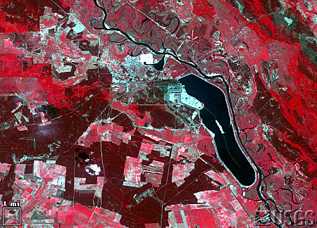
LT5182024008615110 (Landsat 5 TM, 31 May 1986)
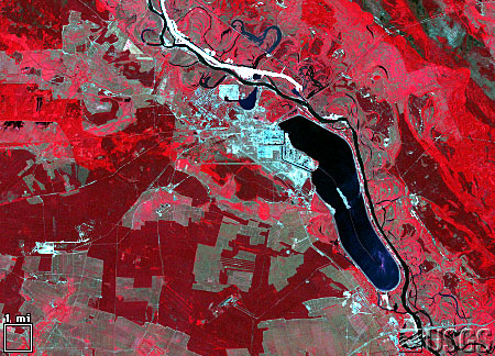
LT4182024009220810 (Landsat 4 TM, 26 July 1992)
The images clearly show farm abandonment. Agriculture appears as a collage of bright red (growing crops) and white (highly reflective bare ground). Many of these areas appear a flat tan-green in 1992, indicating natural vegetation which has taken over the abandoned fields. While the reactor was still on fire, all settlements within 30 km were evacuated, including Pripyat (1986 population 45,000), Chernobyl (1986 population 12,000), and 94 other villages (estimated total population 40,000). As of 1992, this area remained almost completely abandoned.
The radiation also affected wild plants and animals around Chernobyl. Pine forests soon died, cattails grew three heads, and wild animals declined in number. But in the coming years, as the short-lived radionuclides decayed and the longer-lived contaminants settled deep into the soil, the wildlife rebounded. Human abandonment also made habitat available for birds, deer, rodents, wolves, boar and other animals. These populations appear to be increasing despite the extraordinarily high mutation rates caused by contamination in the food chain and by one of the highest background radiation levels in the world.
V. NDVI: A Measure of Vegetation
One way to identify different surface covers has been to compare the intensity of the infrared to the visible light being reflected from the Earth’s surface. An early technique was to subtract the visible red from the infrared intensity. Since vegetation reflects more IR than visible light, the difference between IR and red is an indication of vegetation cover—a sort of “Difference Vegetation Index.” This works well for ground without steep slopes, but for steep surfaces, there is a shadow effect: some areas reflect different intensities of light just because of their slope. But the percent of light reflected is the same, regardless of the intensity of light, so one way to eliminate the shadow/slope problem is express the Difference Vegetation Index as percent by dividing the difference between IR and red intensities by the total light being reflected. This technique is called normalization, and the scheme, which is commonly used to identify the amount of vegetation cover, is called the “Normalized Difference Vegetation Index” or NDVI.
Normalized Difference Vegetation Index
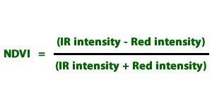
Note: In the latest java version of AnalyzingDigitalImages the NDVI is not functional. NDVI measurements are only possible in the “legacy” version of AnalyzingDigitalImages available on the GSS software legacy page.
DEW3.3. Investigation:
Changes in Mt. St. Helens
Use VegetationAnalysis software to observe and measure changes in Mt. St. Helens before and after the great eruption of 1980.
VI. More Tools for Monitoring Plant Health
We have seen
- the basics of sensors in digital cameras and how powerful they are for making measurements (in Chapters 1 and 2)
- software for analyzing digital images (analyzingdigitalimages used in many DEW investigations)
Time-lapse Movies
The PicturePosts that were described in investigation DEW3.1. Observe Changing Vegetation can be used to make time-lapse movies.
Green-up time-lapse movie.
Green-up is the beginning of a new cycle of plant growth which usually occurs once a year, except in desert areas where rainy periods can produce a flush of new growth more than once a year.
Seasonal weather patterns greatly influence plant behavior, such as flowering, leafing out or greening up, and dropping of leaves or green down. The scientific study of cyclical plant and animal patterns, such as flowering, breeding, and migration, in relation to climatic conditions is known as Phenology.
Below are selected images from a green-up time-lapse movie or a maple tree in Arlington, Massachusetts. Many features of the environment that impact the tree are illustrated: changing light conditions throughout the day and altered by clouds, wind, and rain.

The movie was made with a Kodak DC-290 digital camera with a 128 mb compact flash memory card. What makes this camera so nice to use is its time lapse option, allowing you to set a time interval of 1 minute or longer. The tree movie used a 5-minute time interval. If there is adequate memory available, 1000 pictures can be collected when the camera is plugged into an electrical outlet. This camera has been discontinued by Kodak, but you can find used ones for sale on e-Bay.
Time-lapse Movies Comparing Tides At a Beach and In An Estuary
While working with scientists and educators at the Cape Cod National Seashore, one of the scientists pointed out the discrepency between the tides at the beach and a nearby estuary. The tides at the beach bordering open ocean is roughly a twelve hour cycle, with 6 hours of high tide and 6 hours of low tide. The tides within the neighboring estuary, which is connected to the ocean by a narrow channel, are roughly 8 hours of high tide and 4 hours of low tide. As the water flow out of the estuary, there is less “push” by the water, so the draining of the estuary slows. But when the ocean waters begin to rise with the approaching high tide, the water rapidly flows back into the estuary.
The movies were made with a Kodak DC-290 digital camera with a 128 mb compact flash memory card. Camera was set to take a picture once a minute. Despite being secured to a metal railing, the strong winds buffeted the camera, creating the noticeable shake of frames.

Thunderstorm Time-lapse Movie
Filters for “Seeing” Near Infrared Light
Low-cost Infrared Goggles
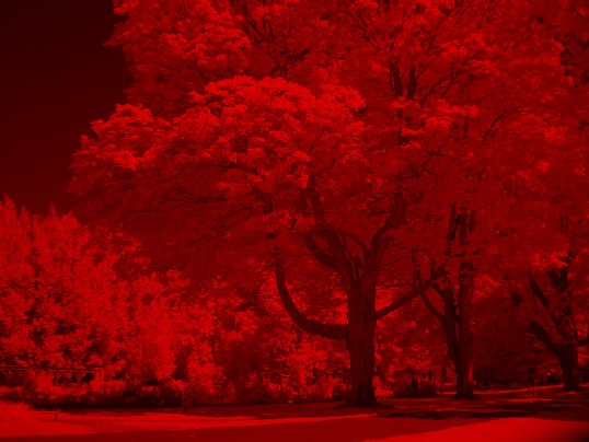
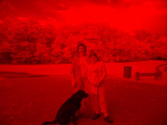
People are not always as quick to believe what they observe with electronic gadgets, especially digital cameras, as they are when they see it first with their eyes. Near infrared (IR) light is a critical wavelength for monitoring the health of plants. It is one of the many wavelengths that satellites “see” from space.
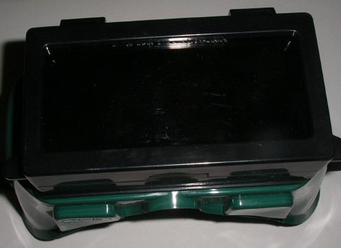
The most “scientific” way to detect near IR light is to use digital cameras or expensive infrared film. However, a gentleman named Bill Beaty invented a design of inexpensive goggles that allow our eyes to see light that is just in the beginning range of the near infrared.
It is not quite the same as what satellites measure, but similar characteristics are observed when looking at plants, buildings, and other objects.
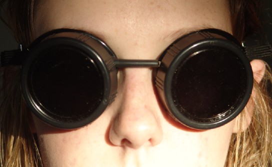

Visit Bill Beaty’s web site for details and a fun read about his invention.
Bill found that “if you lay three layers of Congo Blue [filter that blocks all wavelengths but blue] on one layer of Primary Red [filter that blocks all wavelengths but red], you form an opaque black filter which is very transparent to IR”.
a purple filter blocks green light and lets purple-blue and red light through.
While wearing the IR goggles, human eyes still add “color” to the infrared. Since near infrared is close to red, our eyes will see objects reflecting infrared as red, and objects absorbing infrared will appear dark red to black. In the image on the right, which is what you would see wearing the near infrared goggles, notice that the sky is dark, but this is not because it is absorbing near infrared, rather, there is very little scattering by atmospheric particles, unlike blue light, which is scattered in the sky.
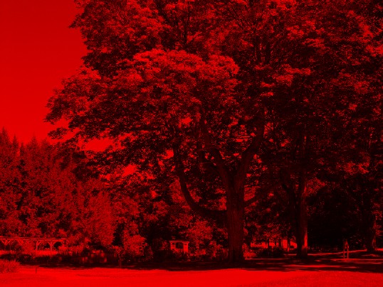
The image on the left is of the same scene but is showing only the red light reflecting from objects.
DEW3.4. Investigation: IR Vision
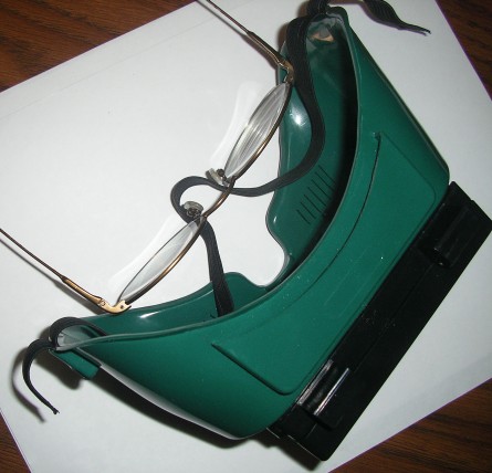
Use the information provided by Bill Beaty’s website for the proper filter combinations make IR goggles. For people who wear glasses, get welding goggles and use the same filter combination (three layers of Congo Blue on one layer of Primary Red):
- Remove the filter for welding from the large face plate,
- Cut the filters to fit the window (use the welding filter as a template),
- Put the filters in place, securing with the available clips that held the welding filter.
Go outside on a sunny day and observe what absorbs and what reflects near infrared. Objects that absorb near infrared will be dark, objects that are highly reflective will appear bright red (sorry, your eyes still add color to what it is seeing).
- Look at the natural world, such as clouds, blue sky, shadows, puddles, ponds, streams, grass, leaves, bark, and flowers.
- Look at what is made by people, such as bricks, cement, shingles, windows, painted wood, etc.
- Take along a mirror and look at your clothing, hair, skin, sunglasses. Do any clothing patterns, such as stripes on shirts, disappear when looking through the goggles?
For those objects that may be touched, compare what is warm to whether it absorbed or reflected near IR. Or, take along a thermal infrared thermometer and measure the temperature of objects that are equally illuminated in the sun.
Note on Safety – do not look directly at the sun while wearing the goggles, nor should you do any activity that requires your full vision while wearing the goggles, such as driving, running, etc. Use the goggles while standing or sitting in order to observe.
Go indoors and look at all of the light sources that are available. What objects emit large amounts of near IR and what don’t? Is this light needed for most visual uses, such as reading?
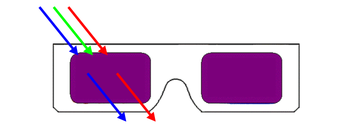
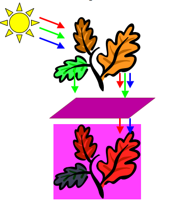
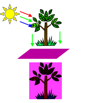
Purple Filters for Detecting Plant Stress
Plants absorb red and blue light to make food (photosynthesis)
Plants don’t need green light to make food, so it is reflected—which is why plants are green! The primary colors of visible light are red, blue, and green. When combined in various amounts, these three colors can produce most colors.
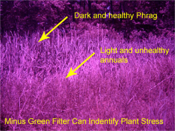
Plants that are stressed or unhealthy don’t make as much food, so they reflect more red and blue light. Now remember what a purple filter does….
a purple filter blocks green light and lets purple-blue and red light through.
The diagram below right shows how healthy plants look dark using the purple filter because they are not reflecting red or blue light. They are healthy and photosynthesizing fully, absorbing all the available red and blue light.
The diagram below left shows how stressed plants look lighter using the purple filter because they are reflecting some red and blue light. They are unhealthy and not photosynthesizing optimally, therefore not all available red and blue light is being absorbed.
DEW3.5. Investigation:
Plant Stress Detector
Make a very low cost durable plant stress detection device: use a popsicle stick, a 1″ x 2″ section of purple gel filter, a glue stick, and a marking pen. Other things may be used besides a popsicle stick, for example chopsticks, pencils, pens, straws….).
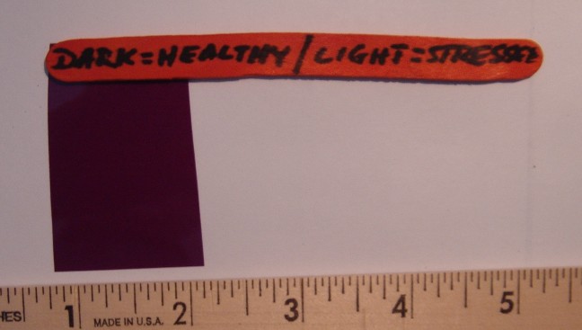
List of purple gel filters that may be used for detecting plant stress:
Medium Purple Filter by Rosco (#049)
Mauve Filter by Lee (#126)
Orchid Filter by Gam (#995)
Sour Grape Filter by Apollo (AP3250)
Handles of sticks may be used for decorations or to write the basic rules for viewing plants: Dark = Healthy Plant ……… Light = Stressed Plant
Additional ideas:
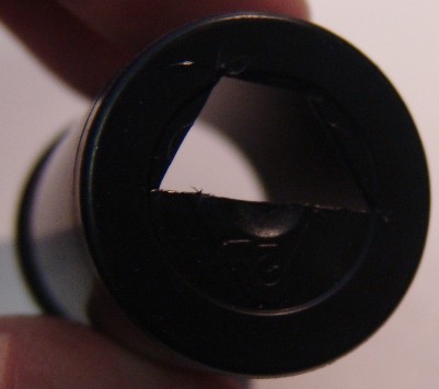
- Make a monocular out of a plastic film canister or small paper cup. With a sharp knife, carefully cut an opening in the bottom and tape the filter over the opening.
- Notice that the opening extends over half of the bottom.
- Substitute additional color filters to study the color of shadows, scattering of colors in the sky, looking at the health of skin, etc.
- Dark blue filters help golfers find their golf balls that are in a field of flowers (or pay retail $40 for a special pair of glasses with the same filters).
Filters for Polarized Light
Elena Cruz, a scientist working in the Museum of Science Boston’s Butterfly Garden, uses polarizing filters to try to visualize what insects see. Insects, such as butterflies, see polarized light, but rather than use the entire spectrum that they capable of seeing, they appear to use certain wavelengths (blue, mostly) of polarized light to recognize their mates, find healthy plants to eat, and decide where to lay their eggs. A digital camera is a useful tool to explore polarized light at various wavelengths. A digital camera can:
- “see” from the ultraviolet to the near infared,
- measure 3 colors at the same time in the visible light range,
- be used with a polarizing filter, and
- be placed in movie mode while the polarizing filter is turned.
Butterflies seen through polarizing filters:
VIII. Visualizing Wetland Health over Time
This section was created by Deb Olstein in support of her practicum at the Antioch New England Graduate School.
Visual media and imaging techniques are powerful tools that may be used to further our understanding of wetlands.
This case study of Flowed Meadow Swamp, Newton, MA shows how three main types of visual analyses can provide
a unique story of wetland health and change over time:
- A. Comparisons of maps and aerial photography
- B. Site photography, and
- C. Manipulation of satellite data
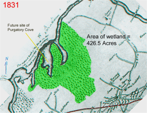
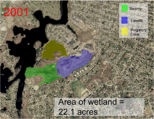
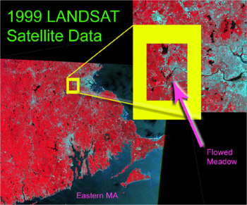
Flowed Meadow Wetland (Swamp) is a twenty two acres shrub and hardwood adjacent to the Charles River in the Metro-Boston area. It once operated as a typical riparian marsh and swamp system of over 400 acres. Industrialization and urbanization (beginning in the early 1800’s) has drastically altered the swamp ecology.
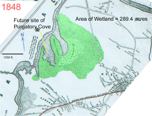
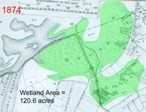
A. Historic Maps & Aerials
Historic maps depict the spatial distribution of Flowed Meadow Wetland over time and allow wetland area measurements that illustrate the steady expansion of streets and farmland in the upland. Maps and aerials were analyzed using MVHimage software (now now AnalyzingDigitalImages) to calculate changes in wetland area. The Flowed Meadow site maps and aerials show the swamp was extensively filled to accommodate urbanization over time. Flowed Meadow swamp lost on the order of 404 acres over 170 years. Trends in spatial distribution, size, and fragmentation of wetlands can tell us much about wetland health over time.
The three historic maps below were obtained from the local historical society and wetland area was highlighted with green to make area pixel measurements more accurate.
Three aerial photographs were obtained from the local planning department and landscape features such as the wetland and landfill were uniformly colored in each image to increase the accuracy of pixel area measurements.
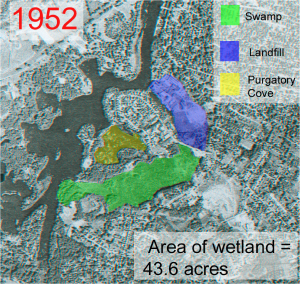
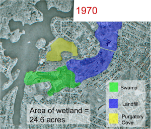
Aerials photos were used to reference field site photography.
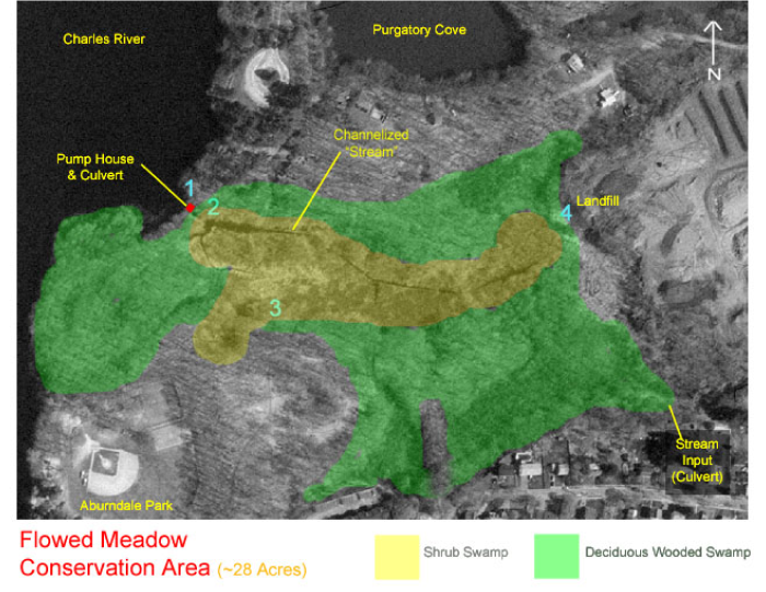
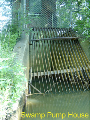
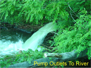
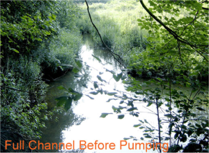
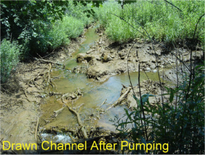
B. Field Site Photography
These photos document wetland functions and processes.
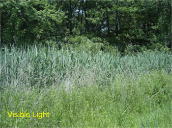
Field site photos with filters
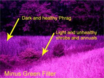
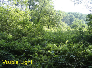
Pictures made with minus green or purple filters were used to amplify contrasting areas of plant health and other natural features. In the following images, vegetation in Flowed Meadow Swamp near landfill appears stressed:
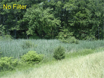
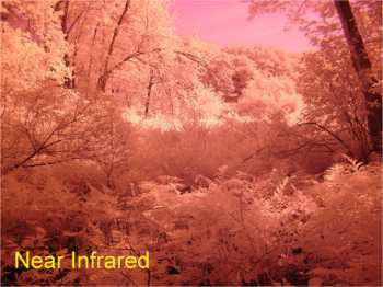
Near Infrared Field Photos
Healthy vegetation looks white in near infrared (IR) light because it reflects an enormous amount of IR energy; stressed plants reflect less IR. IR is commonly used in remote sensing to analyze patterns of vegetation health and distribution.
Infrared field photography of Flowed Meadow Swamp consistently showed the vegetation to be quite lush and healthy. Occurrences of seed heads, trunks, and bare soil were exaggerated, so that wet areas, de-foliated trees, and snags were quickly seen and identified for further investigation. Compare the visible light and IR photos of this field site.
C. Manipulation of Satellite Data
Satellite data was obtained from a free digital library at University of New Hampshire was indexed to calculate percent land coverage type in wetlands and uplands.
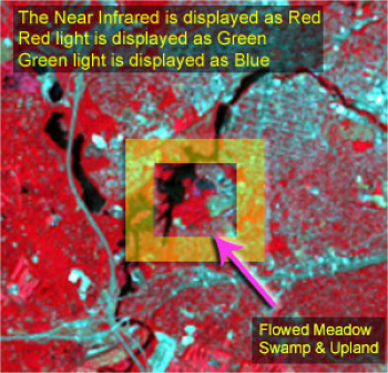
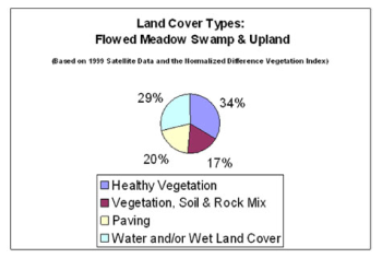
When a Normalized Difference Vegetation Index (NDVI) is applied to satellite imagery, a mathematical formula compares intensities of the reflected infrared and visible red light of a wetland area. Areas of high infrared reflectance and low reflectance of red are representative of healthy vegetation cover, whereas areas of moderate red and infrared reflectance suggest an absence of vegetation and a high incidence of other landscape elements such as paving, soil, or water. MVHimage may be used to calculate NDVI values in the Landsat color composites shown above.
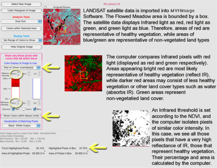
LANDSAT data from 1999 showed that 34% of the Flowed Meadow area is composed of healthy vegetation (areas of open water and paving were also significant.)
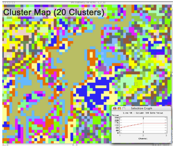
Advanced Image Processing Software
Satellite data may be digitally grouped according to common spectral features. Pixels of similar light and color intensities can be clustered or grouped together to identify landscape features such as water, soil, and lush vegetation. The free software available through Purdue University, Multispec, was used to cluster satellite data in multiple levels of detail. Clustering satellite data is a useful way to quickly map wetland habitat, compare several wetlands, and gain a preliminary understanding of a wetland before visiting.
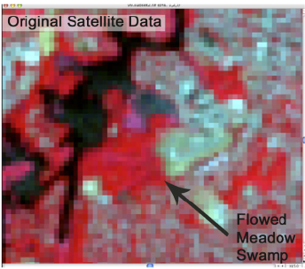
Left: Landsat image before clustering.
Multispec capabilities include:
- Importing Data in a variety of formats, Binary or ASCII format with or without header.
- Displaying multispectral images in black and white, gray scale, or color,
with default or user defined color schemes. - Displaying histogram data.
- Reformatting data, e.g. adding headers, editing out spectral channels,
combining files, adding or modifying channel descriptions, mosaicing data sets. - Creating new channels of data from existing spectral channels.
- Clustering data for display as thematic maps or analyzing cluster statistics.
- Classifying subsets of data in a data file.
- Showing a graph of spectral values of a selected pixel.
- Showing scatter diagrams of data.
- Transferring intermediate of final results as images or as data for use by
other application programs (word processors, spreadsheets, graphics).
Detailed capabilities as well as tutorial exercises can be found at
https://engineering.purdue.edu/~biehl/MultiSpec/
Flowed Meadow Wetlands Conclusions: Learning about Place through Imagery
- Comparing historic maps and aerial photographs of Flowed Meadow Swamp showed and measured wetland change over time (a loss of 404 acres).
- Site Photography documented hydrologic aspects of the swamp and when combined with filters, illuminated vegetation health and landscape patterns.
- The manipulation of satellite imagery identified percent land cover type, plant health, and spatial distribution of landscape elements in the Flowed Meadow area. This data can be used as baseline information for further studies. These types of imaging techniques inform our understanding of Flowed Meadow.
- Swamp history and current ecology, laying the groundwork for future restoration and protection efforts.