DEW3.3. Changes in Mt. St. Helens
Use VegetationAnalysis software to observe and measure changes in Mt. St. Helens before and after the great eruption of 1980,
- AnalyzingDigitalImages software
- 3 images of Mt. St. Helens:
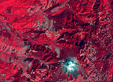
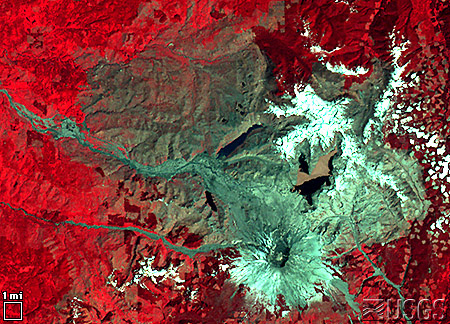
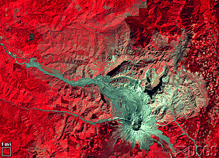
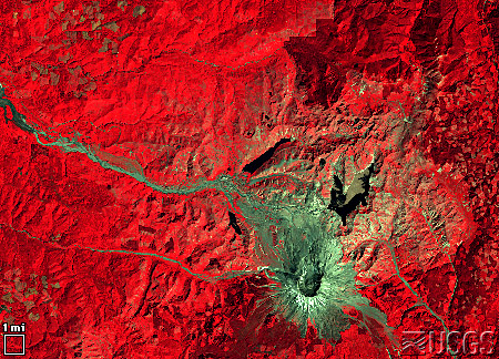
MtStHelens_1973.jpeg
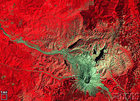
MtStHelens_1983.jpeg
MtStHelens_1996.jpeg
The Tools
1. Launch the AnalyzingDigitalImages software and open the 3 images of Mt. St. Helens as time series. Calibration procedure automatically looks for a white box in the lower right of the images. Just follow the Scale Calibration instructions that pop up automatically in the window on opening of the image files. Then familiarize yourself with the tools described in steps 2–6.
2. Use the menu to the right of ‘Visualization’ to toggle between an RGB picture and a NDVI enhancement. The following is a summary of NDVI values for common surface types:
| NDVI | Surface Cover |
| + 1 | Vegetation |
| 0 | Exposed soil or rock |
| – 1 | Water, snow, clouds |
3. With Point Analysis Tool in the menu button to the right of ‘Analysis Tool’, explore intensities of infrared, red, and green light and the vegetation index, NDVI, at the same pixel for each satellite image.
- Intensities are scaled from 0 to 100%
- Move the cross hair in three ways:
(a) Click the mouse on an area of interest
(b) Click and drag the mouse to an area of interest
(c) Use the small up and down arrows along the upper-right edge
4. With the Line Analysis Tool in the menu button to the right of ‘Analysis Tool’,
- Click and drag the cursor to draw a line.
– Move ends of line in similar way as the Point Tool. - NDVI values for pixels along the line are graphed.
- The number of pixels along the line and length of line are automatically calculated.
- Average NDVI is calculated and color-coded by the year of each image.
– Move cursor to each satellite image to see yearly data on the graph.
– To see all data, move the cursor to the graph window.
5. With the Area Analysis Tool
- Click and drag the cursor to draw a rectangle.
– Move ends of line in similar way as the Point and Line Tools. - A histogram (graph) is created of NDVI values for all pixels inside the rectangles.
– The histogram shows the percentage of values within narrow ranges of NDVI values.
– Data can be viewed year by year when cursor is moved to each satellite image.
– Change the range of min/max NDVI values to calculate the percent of NDVI values between the selected range. - The number of pixels within area and size of the area are automatically calculated.
5. Page Setup and Print—To print the images and graphs, first use ‘PageSetup’ in the File Menu (Mac users). Select ‘landscape’ printing and set scale to 75%.
Questions
Question 6.1.
Using the line analysis tool, measure the diameter of caldera formed by the eruption. A caldera is the crater formed by a volcanic explosion or by the collapse of a volcanic cone. Find the location (x,y coordinates) of the center of the caldera and compare this to the location of the center of the volcano as seen in 1973. Does this explain the direction where most of the volcanic ash fell?
Combine this measurement with an interesting measurement reported on the USGS Earthshots web site to estimate how large an area of solid rock was turned into volcanic debris: “Before the eruption, Mount St. Helens towered about a mile above its base, but on 18 May 1980 its top slid away in an avalanche of rock and other debris. When finally measured on 1 July 1980, the mountain’s height had been reduced by 1,313 feet— from 9,677 feet to 8,364 feet.”
[From Foxworthy and Hill, 1982, p. 11. Lipman, Peter, W., and Mullineaux, Donal, R., (ed.), 1981, The 1980 Eruptions of Mount St. Helens: Washington, U. S. Geological Survey Professional Paper 1250, Washington, D. C. (844 p.), p. 134.]
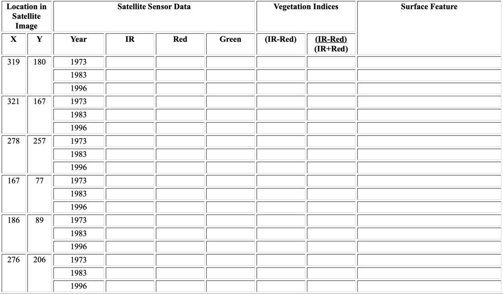
Using the 1973, 1983, and 1996 images of Mt. St. Helens, fill in the following table.*
| Location | Year | NDVI | Surface Feature | |
| X | Y | |||
| 319 | 180 | 1973 | ||
| 1983 | ||||
| 1988 | ||||
| 1996 | ||||
| 321 | 167 | 1973 | ||
| 1983 | ||||
| 1996 | ||||
| 278 | 257 | 1973 | ||
| 1983 | ||||
| 1988 | ||||
| 1996 | ||||
| 167 | 77 | 1973 | ||
| 1983 | ||||
| 1988 | ||||
| 1996 | ||||
| 186 | 89 | 1973 | ||
| 1983 | ||||
| 1988 | ||||
| 1996 | ||||
| 276 | 206 | 1973 | ||
| 1983 | ||||
| 1988 | ||||
| 1996 |
Question 7.2.
Can you make any generalizations from your observations and measurements? Explain.
Now that you have studied these three satellite images of Mt. St. Helens, read the accompanying article provided by the United States Geological Survey for a discussion of the observed changes around Mt. St. Helens. Read the article on the colors observed on Landsat images. Do your findings agree?
- More ideas for investigations concerning temporal changes
For another investigation concerning temporal changes, see Satellite Views of Rondonia, Brazil in the GSS book A New World View, Chapter 5. It explores deforestation of tropical rain forest in the Amazon. - Visit the EarthShots website (http://earthshots.usgs.gov) to find many examples of investigations in temporal change.

*Alternative table:
Question: What are the maximum and minimum values possible for NDVI, provided you cannot divide the sum of the intensities when equal to zero. Based on the colors observed on the Landsat imagery of Mt. St. Helens, an NDVI value near the maximum value corresponds to what type of land surface cover? What about for NDVI values near 0? And what appears to produce NDVI values near the minimum value? Does this
technique appear to work for the satellite images of Mt. St. Helens? Does it have problems?
Further Explore the Visualization Tools
Use the selections within the menu button below “Satellite Image Visualization” to examine the relative intensities of near infrared (IR), and Red (R) and Green (G) light reflected from the Earth’s surface and displayed in the image on your screen.
Use the selections under the dropdown menu in ‘False Color‘ or ‘Data in Images‘ in the DigitalImageBasics program, or the ‘Enhance Colors‘ tab panel in AnalyzingDigitalImages, to examine the relative intensities of near infrared (IR), and Red (R) and Green (G) light reflected from the Earth’s surface and displayed in the image on your screen.
There are 13 Visualizations:
1) Standard color composite of Landsat imagery
IR displayed in the computer display’s Red
Visible Red displayed in the computer’s Green
Visible Green displayed in the computer’s Blue
2-7) IR, Red, or Green as Color or Gray:
A color or gray shade image of only one set of satellite measured intensities. Gray shades allows unbiased viewing of the intensities, and color illustrates the actual contribution to the color composite being displayed on the screen.
Use the remaining six visualizations to quickly see which surface features reflect greater amounts of IR, Red, or Green light.
8-10) IR v R, IR v G, or R v G:
Display the difference between two sets of measurements (A v B means Intensity A – B).
The color of the greater value is displayed, with bright colors showing large differences and dark colors indicating little difference.
IR is displayed as a shade of Gray; Red as a shade of Red; and Green as a shade of Green
Example: using IR v R, if a pixel has 10% IR and 20% Red, the difference is 10% and will be displayed in the computer’s Red.
11-13) Normalized versions of IR v R, IR v G, or R v G
The formula is (Intensity A – Intensity B) / (Intensity A + Intensity B).
The color of the greater value is displayed:
IR is displayed as a shade of Gray
Red as a shade of Red;
Green as a shade of Green
This formula tends to minimize difference in illumination of the surface caused by shadows of clouds and slope of the land surface that cause uneven illumination of the surface by the Sun.
Example: using IR v R, if a pixel has 10% IR and 20% Red, the normalized difference is 10% divided by 30% = 0.33. This value is scaled to 33 and will be displayed in the computer’s Red. Compare this to 10 displayed in previous example.
Further Explore the Analysis Tools
Select analysis tools from the dropdown menus under ‘Data In Images‘ in DigitalImageBasics or ‘Spatial Analysis‘ in AnalyzingDigitalImages.
Pixel Tool
• Cross hair appears where click on the image
• Move by click and drag or with arrows next to x and y position
x increases from left to right & y increases from top to bottom
• Intensity of IR, red, and green light of pixel beneath center of cross hair is output
Line Tool
• Yellow line appears when click and drag on the image. A blue circle at the end of line where cursor clicked and a red circle at the end of line where released mouse click
• Adjust end of line with arrows next to x and y position
x increases from left to right & y increases from top to bottom
• Length of line in pixels is output in lower left edge of the window.
Question: What are the maximum and minimum x and y values you can find on the satellite image?
Question: Using the small white square, which represents one mile along each edge, in the lower left of the image, what is the number of pixels that represents 1 mile? Assuming the edge of one pixel touches the edge of the neighboring pixel, what is the size of one pixel? How many pixels represent 10 miles?
Question: This image is oriented so that north is up and east is to the right. The east-to-west and north-to-south extents of the satellite image are how many miles? What is the distance from the upper-left corner to the lower-right corner of the image? Hint: you will need to use the Pythagorean Theorem if you are using the pixel analysis tool or you may use the line length in pixels output from the line analysis tool.
Question: What is the greatest distance across the snow cover observed on Mt. St. Helens in the lower left corner of the satellite image?
Question: What is the greatest width across the lake observed in the left center of the satellite image? What is the greatest length across the lake?