AN5.1 Satellite Views of Rondonia, Brazil
Adapted from USGS Earthshots – http://www.usgs.gov/Earthshots
Satellite images used in this Investigation show a portion of the state of Rondônia, Brazil, in which tropical deforestation has occurred in the Amazon rainforest.
In the Investigation, Measuring Old Growth Forest Loss (Chapter 3) you determined quantitatively that United States lost much of its forests in the 1700s to 1800s. Now Amazon rainforests are disappearing. In this activity, you can use the image analysis software with satellite images to determine characteristics of forest loss over a number of years.
Materials
Software and images.
Image Analysis Program(s)
ImageJ or AnalyzingDigitalImages
Images
GreatSaltLakeUtah_1987.jpeg
OrlandoDisney_1986.jpeg
MtStHelens_1973.jpeg
MtStHelens_1983.jpeg
MtStHelens_1986.jpeg
Rondonia_1975.jpeg
Rondonia_1986.jpeg
Rondonia_1992.jpeg
Vegetation and Infrared Light
The key to analyzing changes in vegetation in satellite images is to be able to “see” the normally invisible infrared light that vegetation reflects. You see color out in the world because light shines into your eye and is received by the cones and rods of your retina and then processed through to your brain. A digital camera detects color because light shines on the sensors in the camera that record the red, green, and blue intensities of light separately in a digital file. Those color intensities can then be displayed on a red-green-blue (RGB) color computer monitor. Data is recorded for a multitude of tiny “picture elements” that are called pixels. Put all the pixels together on a computer display and you see the whole picture.
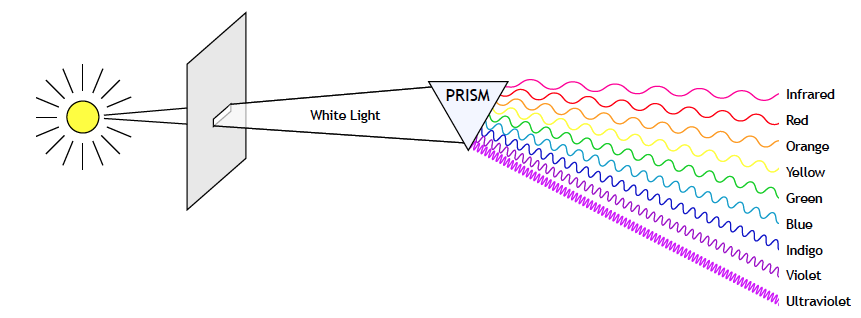
Some animals can actually sense energies of light that are invisible to humans. Bees sense ultraviolet, which is crucial to discriminating flowers for pollination, and snakes sense infrared, which they rely upon to locate their prey.
Satellite sensors have the ability to detect electromagnetic energy of all kinds, including colors of visible light as well as invisible light which is essentially colorless to the human eye. You can see the different types of electromagnetic energy in the diagram, Electromagnetic Spectrum.
For the satellites sensors that detect energies invisible to our eyes, the only way to display data for such energies on computer monitors is to substitute the invisible energy data for one of the 3 visible colors in the computer display. An image where such as substitution has been made is often called a false color image.
Healthy plants reflect a lot of infrared light, so satellite sensors that detect infrared light are very useful in monitoring regions of vegetation.
Identifying Surface Features
Before looking at Amazon forest images, let’s get a sense of what different types of terrain look like in satellite images.
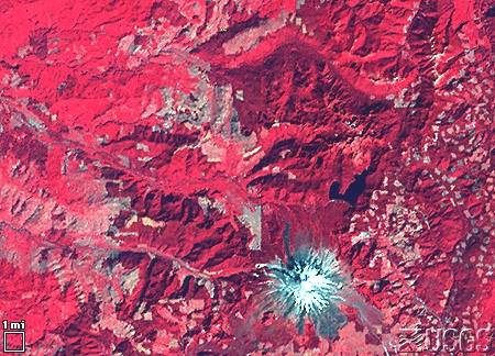
Use ImageJ to open the satellite image MtStHelens_1973.jpg. [You will probably have to navigate to the “Images” folder in the InterpretingSatelliteImages folder after you click on the “Select Image” button.] This picture was taken of Mt. St. Helens in southwestern Washington by sensors on Landsat, the first satellite designed to measure and monitor land resources. Although Landsat measured many wavelengths of the electromagnetic spectrum, three are commonly used when viewing Landsat imagery: infrared light (invisible), red (visible), and green (visible). When the FalseColor program opens the image, the initial display shows no representation of invisible energy, only the intensities of visible red and green light detected by the satellite sensors. Initial settings of the software control buttons are:
| Computer Display Color | Satellite Sensor Energy |
|---|---|
| Red | Red |
| Green | Green |
| Blue | none (off) |
Just for a lark, try making the red satellite sensor energy show as display color green and vice versa: green satellite sensor energy show as red display color. What do you make of that? False colors!
We can assign the infrared (invisible) energy sensor data to a computer display color as a “false color” that we can see. We can assign it to any color: red, blue, green, yellow, cyan, or magenta. Try out different display colors for the infrared measurements.
The “Standard False Color Scheme” for viewing Landsat data, used by most scientists, has ALL the energies displayed as false colors:
| Computer Display Color | Satellite Sensor Energy |
|---|---|
| Red | Infrared |
| Green | Red |
| Blue | Green |
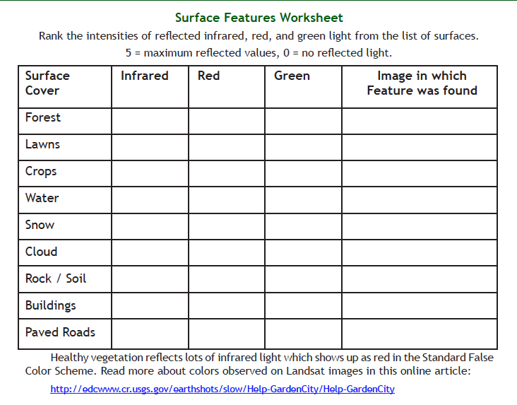
Use the following pictures with the ImageJ program and the Surface Features Worksheet to characterize different types of surface features as vegetation, water, snow, buildings, or pavement:
MtStHelens_1973.jpeg (volcano in Washington State)
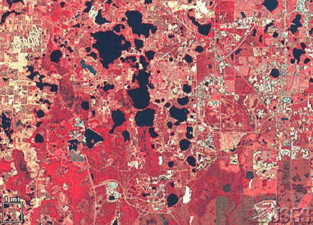
Rondonia_1975.jpeg (tropical rainforest in Brazil)
GreatSaltLakeUtah_1987.jpeg (city, lake, and desert in Utah)
OrlandoDisney_1986.jpeg (city/large developed area in Florida)
Vegetation Analysis Tools
One way to quantitatively analyze different surface covers is to compare the relative intensity of the infrared to visible light being reflected from the Earth’s surface. Higher proportion of infrared light is characteristic of vegetation. An early analysis technique was to compute a “Difference Vegetation Index” by subtracting the visible red intensity from the infrared intensity. This does not work well for areas that have steep slopes or shadows from clouds. To reduce the shadow/slope problems the difference between red and infrared intensities is scaled with the total light being reflected in a computation called normalization. The computed normalized value, that can characterize the amount of vegetation cover, is called the Normalized Difference Vegetation Index abbreviated NDVI.
| NDVI | Surface Cover |
|---|---|
| +1 | Vegetation |
| 0 | Exposed Soil or rock |
| -1 | Water, snow, clouds |
Try out the “Analysis Tools” in the DigitalImageAnalysis program on these images:
MtStHelens_1973.jpeg,
MtStHelens_1983.jpeg,
MtStHelens_1986.jpeg
When you start the DigitalImageAnalysis program, you must:
(a) choose to open either 2 or 3 images for comparison and once the images are open,
(b) enter scale information in the Scale Calibration window. For this, look in the lower corner of the image where there is a white box with the scale size given in units of miles or kilometers. Enter the number in the space labeled “Scale” and the unit in space labeled “Unit.” For example, if the white box has “6 mi” above it, you enter “6” in the “Scale” space and “mi” in the “Unit” space.
Each of the tools explained below can be selected from the “Analysis Tools” popup menu near the center of the program display.
Point (text) Tool
- Place cross hair at point on the image of interest.
- ·Click and hold or click and drag to make the intensity of infrarared, red, and green light of the selected pixel display in the lower right area of the window.
- For more precise positioning of the point selected (moving it pixel by pixel), use the fine control arrows next to x and y position readouts near the right edge of the window:
x increases from left to right
y increases from top to bottom (this may feel counterintuitive and take a little getting used to)
Point (graph) tool:
Creates a graph comparing the vegetation index, NDVI, at the same pixel for each satellite image. Intensities are scaled from 0 to 100%. Select a pixel in same fashion as with the Point (text) tool.
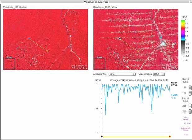
Line Tool:
Draw a yellow line by clicking and dragging on the image
Blue circle is at the starting position of the line (where cursor clicked)
Red circle at the ending position of line (where mouse is released)
Two types of information are displayed:
- a graph comparing the vegetation index, NDVI, along the same line in each satellite image. color-coded by the year of each image.
—Move the cursor to each satellite image to see yearly data on the graph.
—To see all data, move the cursor to the graph window. - the length of the line (in pixels as well as mi or km) appears near the lower right corner of the window
—You can make fine adjustments of the endpoints of line with arrows next to x and y position, which behave just as in the Point Tool
Area tool:
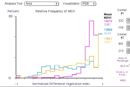
- Select an area by clicking and dragging a rectangle.
- Corner coordinates of the selection are displayed near the lower right edge of the window.
– Corner 1 is the upper left corner and Corner 2 is the lower right corner.
– The x coordinate is on top and y coordinate is below.
– Fine adjustment of corners can be done in a similar way as described using the Point and Line Tools. - The program makes a graph (histogram) showing percentage of NDVI values for all pixels inside the rectangles.
– Histogram shows the percentage of values within narrow ranges of NDVI values.
– As with the Line tool, data color coded for each image can be viewed as you move the cursor from image to image. A composite graph is created (all years together) when the cursor is moved into the graph itself. - The program automatically calculates the area of the rectangle (in number of pixels as well as in square miles or square kilometers) and the mean value of NDVI for the area selected.
Area and Vegetation Tool:
This does the same thing as the Area tool, but you can change the range of NDVI values (minimum/maximum) for which percent of NDVI values is calculated. First click and drag a rectangle, then set the range of NDVI values you want to display percentages of.
Question 5.3.
What are the maximum and minimum x and y values you can find on the satellite image? [Hint: use Point (text) tool.]
Question 5.4.
Using the small white square, how many pixels are in 1 mile? What is the size of one pixel? How many pixels represent 10 miles? [Hint: use Line tool.]
Question 5.5.
Assuming the image is oriented so that north is up and east is to the right how many miles does the entire image span in the east-west (horizontal) direction? How many miles in the north-south (vertical) direction? What is the distance from the upper-left corner to the lower-right corner of the image?
Question 5.6.
What is the greatest distance across the snow cover observed on Mt. St. Helens in the lower right area of the satellite image?
Question 5.7.
In the Mt St. Helens image, what is the greatest width across the lake observed in the right center of the satellite image? What is the greatest length across the lake?
Question 5.8.
In the Mt St. Helens image, what is the diameter of caldera formed by the eruption (1983 or 1986; a caldera is the crater formed by a volcanic explosion or by the collapse of a volcanic cone.) Find the x/y location of the center of the caldera and compare this to the location of the center of the volcano as seen in 1973. As compared with the caldera position in 1973, which direction do you think most of the volcanic ash fell?
See the article provided by the United States Geological Survey for a discussion of the observed changes around Mt. St. Helens:
https://eros.usgs.gov/image-gallery/earthshot/mount-st-helens
Questions about the Rondonia images:
- What is the distance between roads that run west to east on the satellite image.
- Draw a north-south line across these east-west roads and describe how the vegetation changes along the line. What are the average or mean NDVI values along the line for each of the 3 years?
- Create a box with corner #1 at x=363 and y=178 and corner #2 at x=378 and y=190. How many square miles does this box cover? How many pixels are within this box? What surface features appear in this box for the 1986 and 1992 images? What is the average of the NDVI values for all pixels within the box for each of the three images?
- Create a box with corner #1 at x=66 and y=14 and corner #2 at x=295 and y=141.
- How many square miles does this box cover?
- How many pixels are within this box? What is the average of the NDVI values for all pixels within the box for 1975 to 1992?
- Change the min NDVI value (white box in upper right corner) to 0.6 and click the ‘Run’ button. From the graph that results, what is the percent NDVI values within the box that fall within this range of NDVI values (0.6 to 1.0) from 1975 to 1992?
Challenge
Use these satellite images and tools to describe how vegetation is changing in this section of Brazilian rainforest from 1975 to 1992. Examine the many features on the images, such as roads and villages, and explore how vegetation changes within and near these features. Based on these observations, what is your projection for the forest ground cover? In this projection, consider how well the NDVI identifies the type of vegetation covering the ground.
Conclusion
Did your views of deforestation change after working with the satellite data? What additional data would help complete any questions you still have about deforestation in this area of Brazil?