DEW3.2. What Has Been in Your Backyard?
This investigation was developed by Becca Kranz and John Pickle.
Materials and Preparation
To do this activity you will need
- Access to the Internet or download all materials over the Internet first,
- Familiarity with AnalyzingDigitalImages software and spreadsheet software,
- Images of pollen maps in order to analyze them (details below).
Investigation Strategies
Go to the Pollen Viewer archive to see the change of plant populations for a variety of plant species across North America. The actual Pollen Viewer is defunct, but you can see and download the animated GIFs for each species listed by their common name. There are many species to choose from.
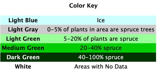
Keep in mind that you want a useful scale of the percent coverage of the species. Having one color have a percent range of 10-100 percent is not ideal because it will decrease the accuracy of your results.
Once you have chosen a species, download the maps from the image files from the website of Dr. Jack Williams, University of Wisconsin, Madison (scroll down to “Visualizations” and “Pollen Viewer” to get to the download links).
Decide on a time interval of maps to analyze. There are 23 maps for each species of plants listed. The oldest map represents 21,000 years ago, followed by maps every 1000 years. An additional map of plant distribution is available at 500 years ago. You may use all 23 maps, study change every 2000 years (11 maps), or pick another time interval of your choosing.
Next analyze each map using AnalyzingDigitalImages. A how-to manual about the different tools in AnalyzingDigitalImages is included with the download and you can also review area measuring techniques in the investigation DEW2.2. Spatial Analysis: Area.
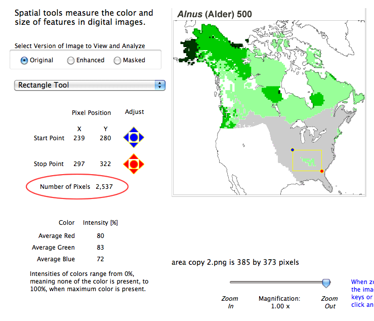
Selecting the ‘Rectangle Tool‘ from the drop-down menu in the ‘Spatial AnalysisTools’ tab panel allows you to choose an area on the map. Perhaps you are interested in a region, a state, or an even smaller area near where you live. Make sure to record in pixels the area of the box you chose. The ‘Number of Pixels’ can be found on the left side of the software window, under the pixel position data. In order to have an accurate investigation, the size and location of the box must remain the same for every measurement you make.
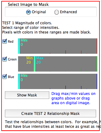
Before making measurements, you must first find the intensities of the colors you wish to measure. In the ‘Mask Color‘ tab panel of AnalyzingDigitalImages, draw a box over one (and only one!) of the colors you are going to measure. The intensities of this color should appear in the color bars below the heading on the left.
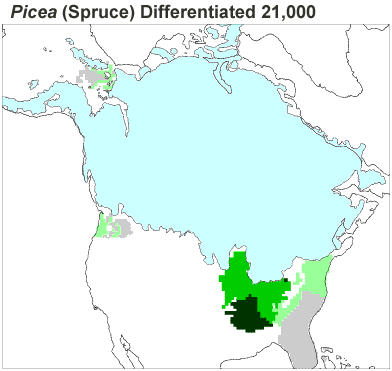
For example, select the dark green color above, which indicates spruce covered 40-100% of the local area.
On the menu bar at the top, click ‘Save Color Masks,’ and then save it as one of the colors. Do this for every color you wish to measure (most PollenViewer maps of single plant species contain 6 colors–see example above). This makes it easy to recall each color setting for every map without having to reset the color every time.
Once all the colors and the area box are set, you can begin making measurements of the amount of the plant in your selected area. Use the ‘Apply Color Mask’ option in the menu bar to recall a specific color. The image will become black and white. The pixels matching the color you selected will be shown in black and everything else will be white. A percentage of highlighted pixels within your selected box will appear on the bottom of the screen.
This is the number you will be analyzing later.
To save this measurement, click on ‘Measurements’ in the menu bar and select ‘Save Measuremet.’ Choose the name and place for the new folder. Until you create a new file, every measurement will be saved under this folder. A window will pop up where you can place extra data. For example, you could write the name of the species, how many years ago this picture is from, what color you were analyzing, etc. Click ‘Save’, and the measurement is saved in the text file you created. Choose another color and repeat the process with every color you have chosen.
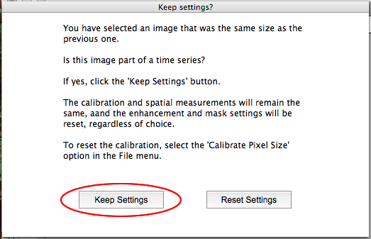
In the File menu select ‘Open Picture’ to pick the next map in the sequence. Remember to always make sure the box size and location do not change. By clicking ‘Keep Settings’ when selecting a new map, the area box remains exactly the same as before.
Analysis Strategies
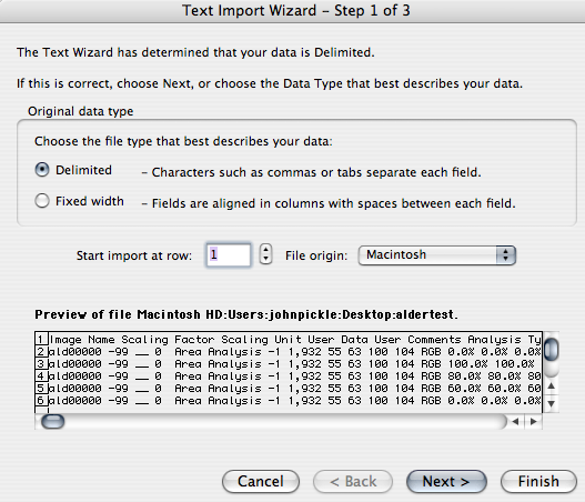
After making the measurements, it is time to analyze the data. First, you must transfer the text file of the measurements into spreadsheet software (such as EXCEL). To do this, click ‘Open’ in the File Menu on the toolbar. Find the name of the text file and open it. There are windows that appear so you can change the settings, but this is not necessary because they are already set for the transfer. Click ‘Finish’ and the spreadsheet will appear.
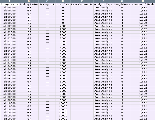
The data saved is in several categories:
- Basic information (image name, scaling factor and unit, columns A-C),
- Basic measurements (data you saved and length/area measurements, columns D-H),
- Coordinates of analysis tool selected (columns I-L),
- Color measurements based on analysis tools and/or color mask (columns M-Y), and
- Color mask results, if used (columns Z-AJ).
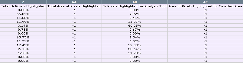
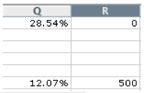
The number you will be working with is the percentage of pixels having the specific color highlighted in the box, located in column Z. But what does that color mean?
The color represents the percent coverage of the species in that area. For example, the dark green color used in the spruce maps represents 40-100% coverage of spruce in that pixel. Double check what the colors represent for your species back at the Pollen Viewer website.
-1 values indicate missing data or data that are not calculated with the options selected. In addition to the percent of the selected color within the area box, the percent of the color within the entire picture is calculated (column AB).
To find the total percent coverage within your area, you must find multiply the percent of the pixels highlighted in the box by the average percent plant cover represented by the map color. For example, dark green for the spruce maps represents 40-100% of the plants within the pixel are spruce. The average is 70%. Do this for each color and add the results.
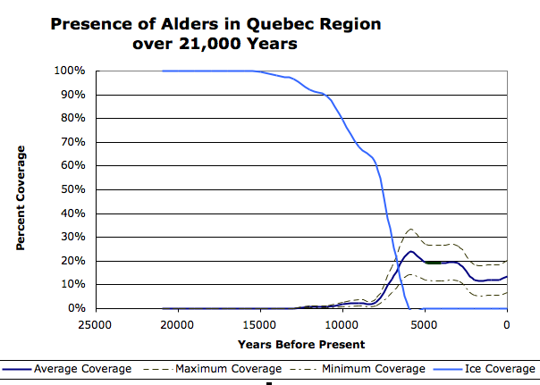
Since the percent coverage is given to you in a range, you have many options, but you must stay consistent. You could use the average percentage for each range, the minimum percentage, or the maximum. These are choices you will need to make. You can even do all three and compare them on one graph (see example below).
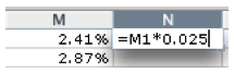
First, you must multiply the percent of pixels with the specific color in the box by the percent coverage represented by the color. The percent coverage is a decimal. To find the decimal, number, divide the percent by 100. For example, a percentage multiplied by 2.5% would be multiplied by.025. Using a formula, EXCEL will do this for you. First, click on an empty box in EXCEL. Type “=”because this shows the program that you are writing a formula. Next click on the box that the math is being done to. It will show up in the box you are writing the formula in, and type in the rest of your formula. For example, if you were multiplying column N by 2.5%, you would click on box M1 and type “=”, then click on the box N1 and type “*.025”. The box would look like “=N1*.025”.
Press ‘Enter’, and EXCEL has done the math for you.
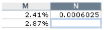
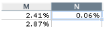
The number appears as a decimal. In order to make it a percent, highlight the cells, go to ‘Format’ on the toolbar and click on ‘Cells’. Under the tab ‘Number’, you can make it a percentage and choose how many decimal places.
Instead of retyping the same formula in every time, you can copy and paste the formula to everywhere it applies. Highlight the box you would like to copy, click on ‘Edit’ in the toolbar and select ‘Copy’. Then click on the box you would like to paste it to, go to ‘Edit’ on the toolbar and select ‘Paste.’
Once you have done this for every measurement, you can then add up all of the percentages to get the total percentage coverage of the region. Again, you must create a formula. If you have five colors in row M, the formula might look like this: “=M1+M2+M3+M4+M5”. This adds all the percentages, giving you total coverage.
To make a graph, highlight the columns of data and click on the ‘Chart Wizard’ icon.
First, you must pick a type of graph. A suggestion of a useful graph is the scatter plot with smooth lines and no dots showing. This will only show you the curve of the plant population in the selected box over the last 21,000 years. When you are satisfied with the previewed graph, click ‘Next.’ The next thing that will appear is the data series. You do not need to change that, just click ‘Next.’ After this you can add in the title of your graph and label the axes. Click ‘Next’ and ‘Finish’, and you are done with the graph.
This particular graph has all three options included: average coverage, maximum coverage, and minimum coverage.
Look at the graphs you made. Do they make sense? If you compare the average percentage to the maximum percentage, they cannot cross paths. The average cannot be more than the maximum. If this happens, you need to go back through your data to find out what went wrong.
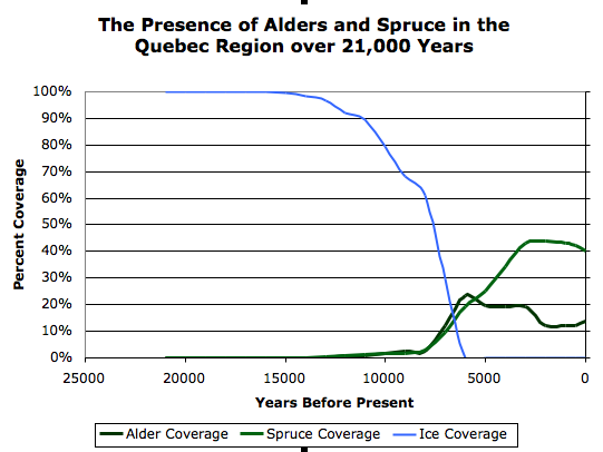
Graph comparing Alder and Spruce pollen data.
Drawing Conclusions
When did the dominant species of plants move into your area? Are there peaks in the coverage of plants in your area? Research as to why there might have been a swift increase or decrease in the population of your species. Sometimes drastic changes are due to the climate, and sometimes to humans or other factors. See what you can find in order to make sense of the conclusions you have drawn from the data. See if you can expand are your data. Did you use the average percentage, the maximum, and the minimum? Could you include other species of plants? How does the ice retreating affect the population growth of the species? Have fun exploring!
Extensions
Research the plants that lived in your selected area. What are their growth characteristics? Were the trees predominantly deciduous or coniferous at different periods of time? What are the shapes of leaves of the different trees? Bark texture? When did one plant type replace another? When did deciduous trees replace coniferous trees?