DEW2. Measuring With Digital Images
Chapter 2
I. The Power of Digital Images
With the inventions of the computer and the Internet, many of us use digital cameras or cameras in smart phones as tools to record memories by capturing images of objects. But digital images are now more than just a way to capture memories. Each image contains millions of color intensity measurements organized spatially so that we can measure the location, motion, orientation, shape, texture, size, chemical and physical properties of objects in the images. Digital cameras provide a way to collect and analyze scientific and educational data and image analysis software provides ready access to these data.
There are nearly unlimited uses of digital image data. Every aspect of industry uses digital images creatively.
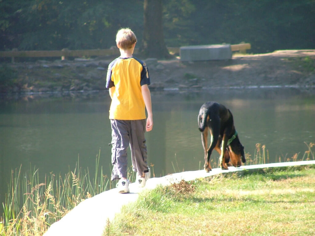
This is a picture of one of the author’s son and dog many years ago. There is quite a bit of personal meaning for him, but there is a tremendous amount of data within this picture too. We can measure the width of the rock wall that they are walking on, the dimensions of the boy and dog, the width of the tree trunk in the background may all be measured because the block of granite has a known length. The colors of nearby grass, water, and nearly everything in the image may be analyzed and measured,
Digital images also a powerful and inexpensive way share data in our Information Age.
But how many of us really know how to harness the data? A primary goal of the NASA-funded project, Digital Earth Watch was to provide scaffolded activities and software for people to learn how to manipulate digital images and to analyze the types of data they contain. Three broad categories of data are:
- spatial data (size, orientation, position, etc.),
- spectral data (color), and
- temporal data (change over time).
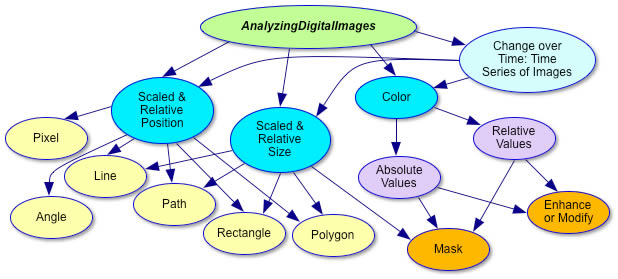
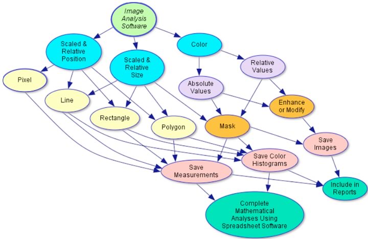
This is a flow diagram of ways to extract information from digital images using the free software, AnalyzingDigitalImages, developed for this project.
Using digital images to measure change over time and identify material properties, we can study cause and effect in many disciplines of science: physics, chemistry, biology, geology, oceanography, meteorology, …nearly all fields of science.

Examples of Using Digital Image Analysis to
Support Various Science Disciplines
| Topic | Examples |
| Physics | Measure motion – displacement, velocity, acceleration in one and two dimensions (e.g. projectile motion) Measure emission, reflection, absorption, and transmission of light from objects |
| Chemistry | Measure color of reactions – titration and/or concentrations Use movie mode to observe and measure crystal growth |
| Biology | Measure growth of plants and animals Study similarities and differences in genetic experiments Study human features – growth, response to situations, etc. |
| Geology | Study change in landscape and land cover over time Document and measure spatial features – sedimentary layers, erosion surfaces, etc. Measure stream response to flooding |
| Oceanography | Study wave sets and patterns Measure changes in beach profiles and patterns Measure tides along beaches, estuaries, marshes, etc. |
| Meteorology | Observe how clouds move and change based on approaching weather systems Study sky color and relate to air quality Measure sky optic features – rainbows, halos, sun dogs, etc. |
| Environmental Science | Study landscape reclamation projects Study seasonal changes of vegetation using PicturePost images (http://picturepost.smugmug.com/) Measure spread of invasive plant species Measure effects of invasive animals on plant foliage (gypsy moth, wooly adelgid, etc.) Measure spread of plant foliage blights |
II. Spatial Analysis
A digital image in its simplest analysis is a two dimensional thing, so the first things we might think of to measure in a digital image is dimensions of objects and areas.

DEW2.1. Investigation:
Spatial Analysis—Length
How to calibrate a digital image in terms of ben 4th and then measure lengths of objects and features in the image.
DEW2.2. Investigation:
Spatial Analysis—Area
There are three ways to measure the area of objects in digital images using tools in AnalyzingDigitalImages software: Rectangle tool, Polygon tool, and Masking.
In addition to analyzing images that are taken with our own digital cameras, we can use images that are acquired using cameras that are far above or far from the objects of interest to us. Gathering data like that from afar is called remote sensing.
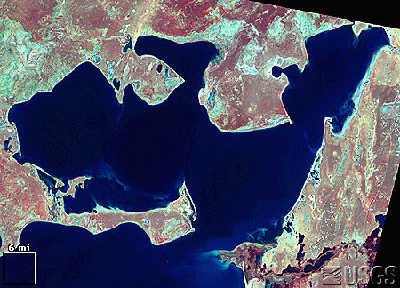
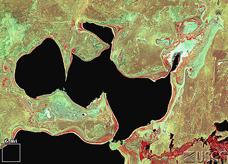
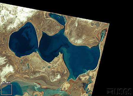
DEW Challenge: Disappearing Sea
Analyze the images below to calculate the rate the Aral Sea was disappearing from 1973 to 1999. Download the Aral Sea satellite images and use the “Area” tool in the AnalyzingDigitalImages software. Use the techniques from DEW Investigation 2.2 Spatial Analysis: Area.
To download the image, either right-click or click and hold on the image. A pop-up menu will have the option to ‘Save Image As…’, which allows you to save the image on your computer. You may do this to download most images available on the Internet.
III. Spectral Analysis
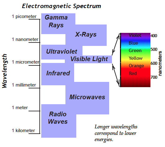
The word spectral can mean “ghostly,” but we are using its other meaning which relates to the rainbow of color formed when all the energies of white light are spread out and arranged in order. Similarly, the electromagnetic spectrum is an ordered arrangement of invisible radiation with energies ranging from high energy gamma rays to the longest low energy radio waves and including visible light (see diagram at right). Electromagnetic energy is colorless—we see colors in visible light only because of functions going on in the eyes and brain.
Space satellites have cameras/sensors to detect energies invisible to our eyes, but to analyze them it’s helpful to display those energies as visible light computer monitors. For just one value of electromagnetic energy we could use shades of gray that give brightness information ranging from black representing no brightness to white representing very bright. Color monitors display all colors as combinations of three colors: red, green, and blue (RGB), so with a color monitor, each of those three colors can represent a different invisible electromagnetic energy. The displayed colors can help us identify physical properties of objects, Earth’s surface, gas components of the atmosphere, even the Earth’s magnetic field, depending on what type of camera/sensor is used.
DEW2.3. Investigation:
Color in Surface Features
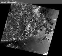
Use “False Color” in DigitalImageBasics to investigate features in Landsat images.
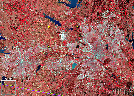
These images show the Dallas – Fort Worth metropolis in northeast Texas. This city grew significantly, from 2,378,000 in 1970 to 3,776,000 by 1988.
Satellite image
LM1029037007407190
(Landsat 1 MSS, 12 March 1974)
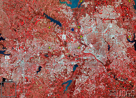
Satellite image
LM5027037008908190
(Landsat 5 MSS, 22 March 1989)
These images show the urban/suburban areas expanding into arable land in the countryside. (Note: You can right-click and save the image to your computer.)
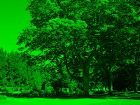
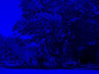
IV. Representative Color In Digital Images
Today there are many sensors designed to “photograph” a wide range of the electromagnetic spectrum, and in order to visualize these data, the intensities of the invisible light are used as one or more of the color layers in a digital image. This is particularly common with satellite imagery. Since images taken from above the Earth’s surface are so unusual because of their unique perspective, we will first explore a common satellite image (Landsat, in particular) using a scene photographed from the ground.
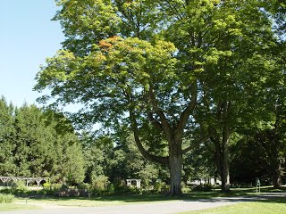
Most digital cameras, with a little alteration, can take images in the near infrared light (NIR), which is invisible to our eyes. What color would you use to display it?
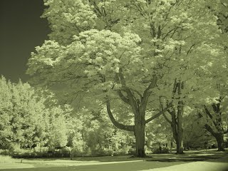
As a first try, how about in shades of gray, with black representing no infrared light, and white showing high intensities of infrared light. Compare this image to the true color image.
At left: tree landscape in near infrared light.
Since a digital image may contain three measurements of intensities within the electromagnetic spectrum, we can combine several of the measurements from the above images to create one. In this case, the NIR will be displayed as the red layer, the red intensities as the green layer, and the green intensities as the blue layer – so none of the true colors are displayed as the same color in the digital image. This is truly what is often called a false color image! A more flattering term for this is representative color—a display color is representing a detected energy of light that is normally invisible to us.
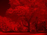
Voila, pink trees and cyan (blue-green) pathways!
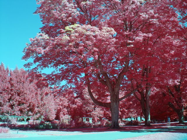
This representative (false) color image is one of the standard color composites used with Landsat data.
It is often referred to as an NRG image: near IR, red, and green image.
It is a representative color image where no intensity data is displayed as its real color.
Since 1972 Landsat sensors have provided rich information about land features, including the mapping of the location, aerial extent, and health of vegetated landcover. The NRG color composite illustrated below helps scientists to compare vegetation coverage of selected location over time.
Based on this color mapping, healthy vegetation reflects a large portion of NIR and will appear as red to pink. Urban areas and other non-vegetated areas reflect relatively large amounts of all light will appear light blue/cyan/gray. Water, which does not reflect much NIR, red, or green light, appears dark.
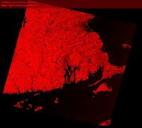
Since our eyes have varying sensitivity to red, green, and blue, it is helpful to view each set of measurements in black and white.
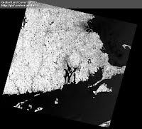
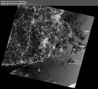
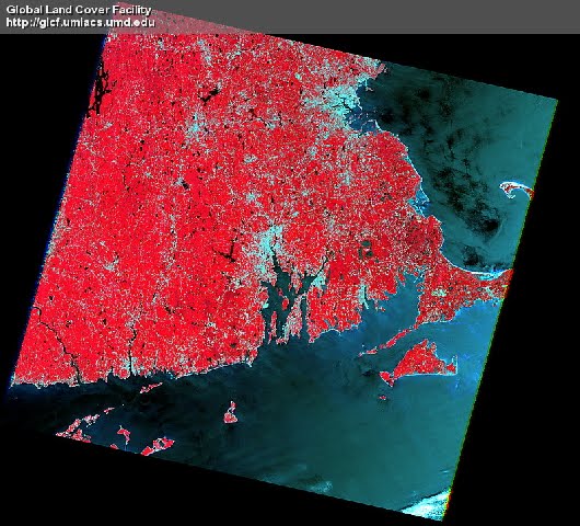
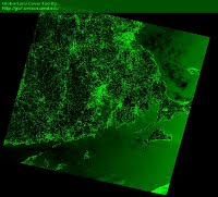
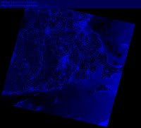
A Landsat image of eastern Massachusetts with the NRG color composite:
NIR measurements are mapped as the image’s red layer, red intensities appear as green colors, and measured green light is displayed as blue.
Image from Landsat Clic ‘N Pic .
Satellites typically measure more than three wavelengths of the electromagnetic spectrum. Landsat measures 7 wavelengths. This means there are 210 unique ways to view the combinations of Landsat measurements with a digital image! This is why standard color composites were created – to minimize and standardize the options for the viewer, but there are ways to use all of the measurements at once. To access more than three sets of satellite measurements, you need to use advanced remote sensing software such as Multispec, described below.
V. Free Image Analysis Software
Apart from the software provided with this book (ColorBasics, DigitalImageBasics, and AnalyzingDigitalImages), there are a number of free image analysis programs available for both Macintosh and Windows computers that make use of digital images in the science classroom a powerful teaching tool.
Two in particular are useful if you are considering projects requiring a number of high-end mathematical/statistical functions. They have nearly unlimited analyses options:
- ImageJ (https://imagej.net/ij/) or
- Multispec (http://cobweb.ecn.purdue.edu/~biehl/MultiSpec/).
These programs are fast, powerful, and designed for sophisticated scientific research. The learning curve is not trivial, in particular because terms are more likely to contain jargon, but once mastered, they are wonderful programs.
Basics features of AnalyzingDigitalImages are summarized in this diagram.
DEW Software descriptions:
ColorBasics has tools for understanding:
- the difference between color as pigment and color as light
- how colors are created in a computer display
- color spaces
DigitalImageBasics has tools for understanding:
- the relationship between pixels and resolution
- how camera colors are displayed on a computer screen
- tools for analyzing color in images
- the meaning of “false color” and
representation of invisible wavelengths as visible colors.
AnalyzingDigitalImages has tools for:
- enhancing and measuring color in images
- measuring spatial elements in images
- making color masks
- analyzing time series of images
DEW2.4. Investigation:
How to Take the Best Digital Photos
Learn techniques for obtaining scientifically accurate spatial measurements and color from your digital camera or smartphone.
DEW2.5. Investigation:
What Parent Do You Most Look Like?
By Rebecca Kranz—a high school freshman intern at the Museum of Science Boston when she created this investigation.
When a baby is born, affectionate onlookers will often comment on the features of the baby. “It has its mother’s eyes” or “it has its father’s nose” are phrases commonly used to describe the baby’s face. Now there is a more accurate way to see exactly who you look most like, your mom or your dad, and how much.
Materials
- Pictures of people, with ruler for reference. To start you need a picture of those whose faces you plan to measure, ideally with a ruler in the picture to make it easy to calibrate measurements. If possible take the pictures yourself. This will ensure that the picture provides good measurements, as well as allow you to create an accurate scale.
- Software. You’ll need to get yourself acquainted with DEWimage, as these are the tools you will be using to make your measurements.
- Alternative to software: a ruler. If you do not have access to these tools, it is also possible to make measurements on the picture using a ruler.
Investigation Strategies
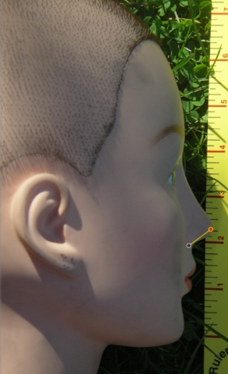
In the photograph on the right, the line is measuring the length of the bottom part of the nose. When using the DEWimage software, the length of the line, in pixels, is shown, as well as information regarding the intensities of colors along the line. There are many other facial features you can measure. Be creative. Come up with as many measurements as you can. The more measurements you make, the more numbers you have to analyze and the more accurate your conclusion will be.
Scaling the Image When Using a Ruler
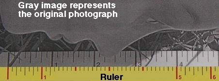
In the gray part of the printed photograph above, four inches along the ruler was measured as five inches. Using proportions you can scale all of the measurements accurately. In this case, the 4 inches on the picture correspond to the 5 inches shown by the ruler. As a proportion this is 4/5, which equals 0.8. This means that for every measurement you make, simply divide by .8 to get the actual length of the line. If you are using the digital photograph with the DEWimage, this scaling occurs automatically for all length and area measurements.
Data Analysis Stragies
The saved measurements from DEWimage are easily imported into EXCEL or other spreadsheet programs. The coordinates of the lines you drew, the lengths of the lines, the average intensities of them are available in the spreadsheet. You will need to move columns of data next to the other sets of data to make graphing easier. If you used the hard copy, the scaled measurements and the labels must be manually entered into EXCEL in the same fashion.
In order to create a graph, the sets of data must be in adjacent columns.
| Mom’s Data | Dad’s Data | My Data | |
| Length of Face | 11.6 | 9.29 | 9.09 |
Highlight the data you would like to include, click on the chart wizard, and follow the steps to making a graph in EXCEL. Do not add the unit of measure to the number (11.6 inches). Just insert the number itself and add units to the axis labels. In order to have each point on the graph labeled, make sure to highlight the column with the name of the measurements along with the data.
Drawing Conclusions
So, who are you more alike? Can you find certain patterns in the graph? Are there some ways you are like each parent? Which measurements helped you to come up with your decision? Are there more measurements you could have made on your face or other faces? Could you expand the investigation to include other family members? Try it out. Construct your own investigation on facial similarities. Expand your investigation to include more than your family. Let your imagination go wild.