
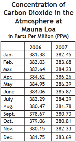
CC6.1. The Findings From Mauna Loa
Investigation
I. Carbon Dioxide in the Northern Hemisphere
This investigation is “selected” by the
Climate Literacy and Energy Awareness
Network (CLEAN)
As a student assistant, your job is to analyze data from the strip chart recorder and to find the average concentration of carbon dioxide for each month. It takes many hours of measuring, recording numbers, and calculating to find a monthly average from all that data! You have summarized the monthly data averages from two years in two columns as below.
Looking at the table you realize it is difficult to interpret. Having the data in a graph rather than a table would enable you—and your supervisor—to readily see if changes occur over time, if there is a pattern, or an unusual variation. So, you decide to plot the data on a graph before giving the information over to your supervisor. Plotting data for 2006 and 2007 will show you how the atmosphere changed.
Sources: Scripps Institution of Oceanography (http://scrippsco2.ucsd.edu/data/in_situ_co2/monthly_mlo.csv)
NOAA Earth System Research Laboratory
(http://www.esrl.noaa.gov/gmd/ccgg/trends)
On graph paper, plot the data shown. Create a line graph, with the dates along the bottom, from January 2006 to December 2007. To show the pattern clearly, choose a vertical scale that does not start from zero, but which ranges from the lowest to the highest measurements of carbon dioxide. Draw a line connecting the data points so you can see the pattern easily. Be sure to label the axes of your graph.
QUESTIONS
6.1 What pattern is shown in the data?
6.2 During which months does the concentration of carbon dioxide seem to increase? How might you explain this increase?
6.3 During which months does the concentration of carbon dioxide seem to decrease? How might you explain this decrease?
6.4 During which months would you expect plants to be most actively growing? Would they be absorbing or releasing carbon dioxide when they are actively growing? Why?
6.5 During which months would you expect leaves to be falling, and annual plants to be dying? Would plants absorb or release carbon dioxide when they lose their leaves, die, and decay?
6.6 Does the data support a connection between plant growth cycles and atmospheric concentration of carbon dioxide or some other causes? Explain your ideas.
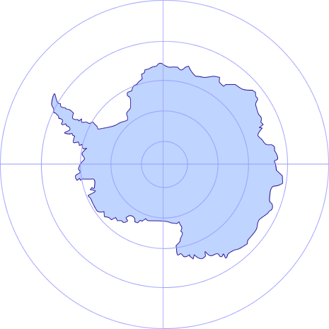
II. The Findings from the South Pole:
Carbon Dioxide in the Southern Hemisphere
“Hold it!” you might say. “Carbon dioxide levels seem to vary with the seasons. However, Mauna Loa is in Earth’s Northern Hemisphere. When we are having summer in the Northern Hemisphere, people who live in the Southern Hemisphere are having winter. I wonder if the yearly variation in the concentration of carbon dioxide is the same in the Southern Hemisphere as it is here on Mauna Loa?”
The South Pole station is at the center of the continent of Antarctica, where longitude lines cross. Data was collected in flasks and sent to a laboratory for analysis, except during 1960 to 1963, when a continuous sampling station was set up. Data collection continues today by the flask sampling method.
Before reporting your data, you log onto the computer and look for a file of data from a Southern Hemisphere station also assigned to monitor carbon dioxide concentration. Got it! There is a carbon dioxide monitoring station at the South Pole! According to the computer log, the South Pole observing station is on an ice- and snow-covered plateau over a mile and a half above sea level, and about 7 miles from the pole.
Concentration of CO2 in the Atmosphere at the South Pole in Parts Per Million (ppm)
Source: Scripps Institution of Oceanography
(http://scrippsco2.ucsd.edu/data/spo.html)
QUESTIONS
Predict what you think the graph of carbon dioxide concentration measured at the South Pole and plotted each month will look like.
6.7. Will the graph be similar to or different from the Mauna Loa graph? Explain.
6.8. Will it be a straight line, with no peaks and valleys of carbon dioxide concentration?
6.9. If peaks and valleys do occur, will they occur at the same times as at Mauna Loa?
6.10. Will there be as big a difference between the maximum and minimum concentration at the South Pole as at Mauna Loa?
Plot the South Pole data from the table below. Use the same chart that you used to plot the data from Mauna Loa. Use X’s to plot the points so you can distinguish them from the Mauna Loa data. Draw a smooth line through the data points so you can see the pattern easily.
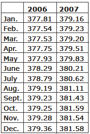
Compare the results with your predictions.
6.11. Which of your predictions were correct?
6.12. Were you surprised by any patterns in the data? If so, by what?
6.13. How can you explain your findings?
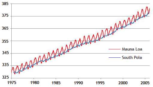
Look again at your graph of the concentration of carbon dioxide during 2006 and 2007. In addition to the seasonal changes in the level of carbon dioxide, can you also detect a trend? To observe this trend over a longer period of time, let’s look at the findings Mauna Loa station and the South Pole for the period 1975 to 2005.
III. Results from the Past 30 Years
Monthly concentrations of carbon dioxide in air
Please look for the most recent CO2 concentration data at the Trend in CO2 page of the NOAA Global Monitoring Laboratory website.
QUESTIONS
6.14 Refer to the graph on the Trend in CO2 page or on this page and estimate the average concentration of carbon dioxide in the atmosphere during the year 1975. How many parts per million (ppm) were measured that year?
6.15 Estimate the average concentration of carbon dioxide in the atmosphere during the most recent year (or 2005 if you do have access to the most recent record online). How many ppm were measured that year?
6.16 By what percentage has the carbon dioxide concentration increased since 1975? (Percentage equals the increase in ppm divided by ppm in 1975, times 100.)
CO2 monitoring data is also available at Earth System Research Laboratory Global Monitoring Division site http://www.esrl.noaa.gov/gmd/
E.g. choose menu
Data > Tools > Data Viewer
Then choose a station, click on “Carbon Cycle Gases”
and plot “Time Series” graphs of data.
[Original java-based GSS online interactive, Findings from Mauna Loa and Beyond, used CO2 concentration monitoring data from around the world with graphing tools built in, but fell prey to upgrades in java security protocols]
Again, for the most current data in graphical form, see https://gml.noaa.gov/ccgg/trends/index.html where graphs show monthly mean carbon dioxide measured at Mauna Loa Observatory, Hawaii. But CAUTION, prepare to be depressed: the concentration of CO2 in the Earth’s atmosphere is still rising (as of 2022), owing largely to human combustion of fossil fuels. The carbon dioxide data on Mauna Loa constitute the longest record of direct measurements of CO2 in the atmosphere. They were started by C. David Keeling of the Scripps Institution of Oceanography in March of 1958 at a facility of the National Oceanic and Atmospheric Administration.